WPF – 快速指南
WPF – 快速指南
WPF – 概述
WPF 代表 Windows Presentation Foundation。它是用于构建 Windows 应用程序的强大框架。本教程解释了构建 WPF 应用程序需要了解的功能,以及它如何为 Windows 应用程序带来根本性的变化。
WPF 最初是在 .NET framework 3.0 版本中引入的,然后在后续的 .NET framework 版本中添加了许多其他功能。
WPF 架构
在 WPF 之前,Microsoft 提供的其他用户界面框架(如 MFC 和 Windows 窗体)只是 User32 和 GDI32 DLL 的包装器,但 WPF 仅很少使用 User32。所以,
- WPF 不仅仅是一个包装器。
- 它是 .NET 框架的一部分。
- 它包含托管和非托管代码的混合。
WPF 架构的主要组成部分如下图所示。WPF 最重要的代码部分是 –
- 演示框架
- 演示核心
- 米尔科
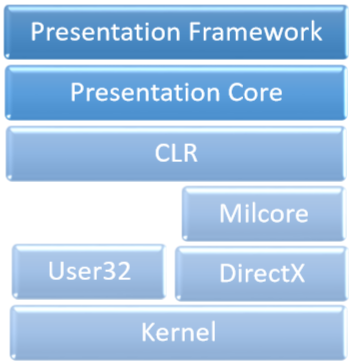
该演示框架和演示核心已经写在托管代码。Milcore是非托管代码的一部分,它允许与 DirectX(负责显示和渲染)紧密集成。CLR通过提供许多功能(例如内存管理、错误处理等)来提高开发过程的效率。
WPF——优势
在早期的 GUI 框架中,应用程序的外观和行为方式之间没有真正的分离。GUI 和行为都是用相同的语言创建的,例如 C# 或 VB.Net,这需要开发人员付出更多努力来实现 UI 和与之相关的行为。
在 WPF 中,UI 元素是用 XAML 设计的,而行为可以用 C# 和 VB.Net 等过程语言实现。所以很容易将行为与设计者代码分开。
使用 XAML,程序员可以与设计人员并行工作。GUI 与其行为之间的分离使我们能够通过使用样式和模板轻松更改控件的外观。
WPF – 功能
WPF 是一个强大的框架来创建 Windows 应用程序。它支持许多很棒的功能,其中一些已在下面列出 –
| Feature | 描述 |
|---|---|
| Control inside a Control | 允许将另一个控件内的控件定义为内容。 |
| Data binding | 在用户界面上显示 UI 元素和数据对象之间的数据并与之交互的机制。 |
| Media services | 提供一个集成系统,用于构建具有常见媒体元素(如图像、音频和视频)的用户界面。 |
| Templates | 在 WPF 中,您可以直接使用模板定义元素的外观 |
| Animations | 在用户界面上构建交互性和移动性 |
| Alternative input | 在 Windows 7 及更高版本上支持多点触控输入。 |
| Direct3D | 允许显示更复杂的图形和自定义主题 |
WPF – 环境设置
Microsoft 为 WPF 应用程序开发提供了两个重要的工具。
- 视觉工作室
- 表情混合
这两个工具都可以创建 WPF 项目,但事实是 Visual Studio 被开发人员使用得更多,而 Blend 被设计人员使用得更频繁。对于本教程,我们将主要使用 Visual Studio。
安装
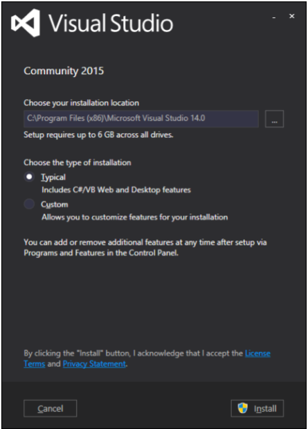
Microsoft 提供了一个免费版本的 Visual Studio,可以从VisualStudio下载。
下载文件并按照下面给出的步骤在您的系统上设置 WPF 应用程序开发环境。
-
下载完成后,运行安装程序。将显示以下对话框。
-
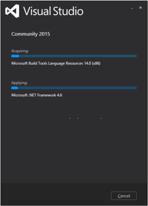
单击安装按钮,它将开始安装过程。
-
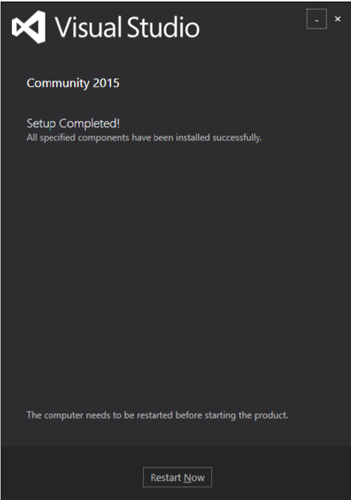
安装过程成功完成后,您将看到以下对话框。
-
如果需要,关闭此对话框并重新启动计算机。
-
现在从开始菜单打开 Visual Studio,它将打开以下对话框。
- 完成所有操作后,您将看到 Visual Studio 的主窗口。
您现在已准备好构建您的第一个 WPF 应用程序。
WPF – 你好世界
在本章中,我们将开发一个简单的 Hello World WPF 应用程序。所以让我们按照下面给出的步骤开始简单的实现。
- 单击文件 > 新建 > 项目菜单选项。
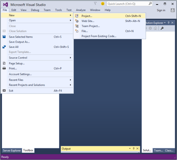
- 将显示以下对话框。
-
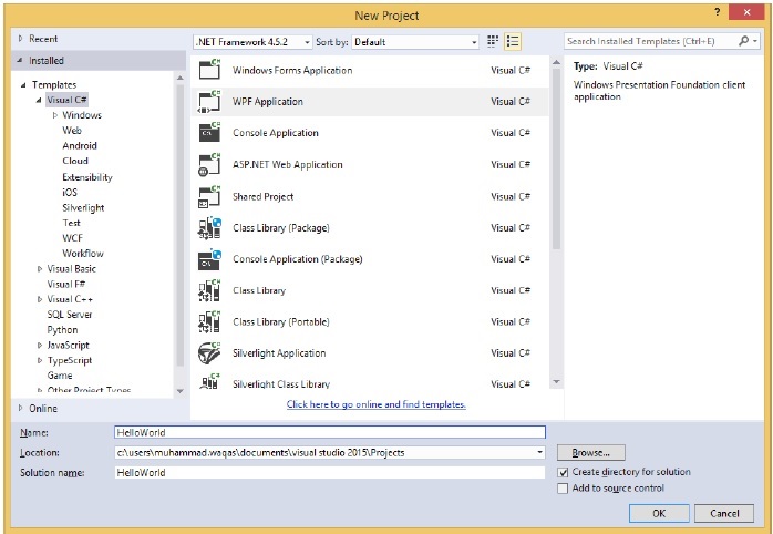
在模板下,选择 Visual C#,然后在中间面板中,选择 WPF 应用程序。
-
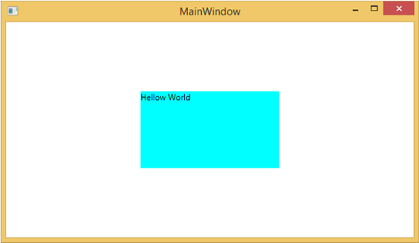
为项目命名。在名称字段中键入HelloWorld,然后单击确定按钮。
-
默认情况下,会创建两个文件,一个是XAML文件(mainwindow.xaml),另一个是CS文件(mainwindow.cs)
-
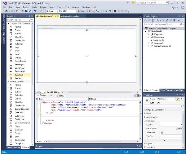
在 mainwindow.xaml 上,您将看到两个子窗口,一个是设计窗口,另一个是源(XAML)窗口。
-
在 WPF 应用程序中,有两种方法可以为您的应用程序设计 UI。一种是简单地将 UI 元素从工具箱拖放到设计窗口。第二种方法是通过为 UI 元素编写 XAML 标记来设计 UI。当拖放功能用于 UI 设计时,Visual Studio 会处理 XAML 标记。
-
在 mainwindow.xaml 文件中,默认写入以下 XAML 标记。
<Window x:Class = "HelloWorld.MainWindow"
   xmlns = "http://schemas.microsoft.com/winfx/2006/xaml/presentation"
   xmlns:x = "http://schemas.microsoft.com/winfx/2006/xaml"
   Title = "MainWindow" Height = "350" Width = "604">

   <Grid>
   </Grid>

</Window>
- 默认情况下,Grid 设置为页面后的第一个元素。
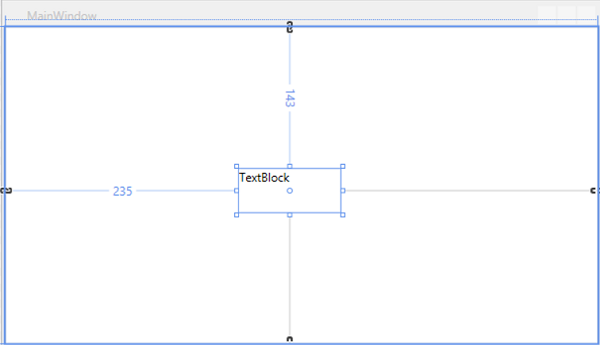
- 让我们转到工具箱并将一个 TextBlock 拖到设计窗口中。
- 您将在设计窗口中看到 TextBlock。
-
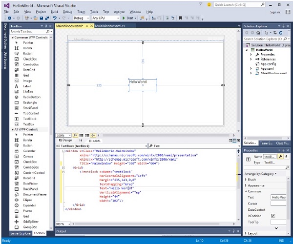
当您查看源窗口时,您将看到 Visual Studio 已为您生成了 TextBlock 的 XAML 代码。
-
让我们将 XAML 代码中 TextBlock 的 Text 属性从 TextBlock 更改为 Hello World。
<Window x:Class = "HelloWorld.MainWindow"
   xmlns = "http://schemas.microsoft.com/winfx/2006/xaml/presentation"
   xmlns:x = "http://schemas.microsoft.com/winfx/2006/xaml"
   Title = "MainWindow" Height = "350" Width = "604">

   <Grid>
      <TextBlock x:Name = "textBlock" HorizontalAlignment = "Left"
         Margin = "235,143,0,0" TextWrapping = "Wrap" Text = "Hello World!"
         VerticalAlignment = "Top" Height = "44" Width = "102" />
   </Grid>

</Window>
- 现在,您还将在设计窗口上看到更改。
上述代码编译执行后,会看到如下窗口。
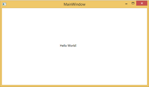
恭喜!您已经设计并创建了您的第一个 WPF 应用程序。
WPF – XAML 概述
在使用 WPF 时,您首先会遇到的事情之一是 XAML。XAML 代表可扩展应用程序标记语言。它是一种基于 XML 的简单的声明性语言。
-
在 XAML 中,创建、初始化和设置具有层次关系的对象的属性非常容易。
-
它主要用于设计 GUI,但它也可以用于其他目的,例如,在 Workflow Foundation 中声明工作流。
基本语法
当您创建新的 WPF 项目时,默认情况下您会在 MainWindow.xaml 中遇到一些 XAML 代码,如下所示。
<Window x:Class = "Resources.MainWindow"
   xmlns = "http://schemas.microsoft.com/winfx/2006/xaml/presentation"
   xmlns:x = "http://schemas.microsoft.com/winfx/2006/xaml"
   Title = "MainWindow" Height = "350" Width = "525">

   <Grid>

   </Grid>

</Window>
上面的 XAML 文件包含不同种类的信息。下表简要说明了每个信息的作用。
| Information | 描述 |
|---|---|
| <Window | 它是根的开放对象元素或容器。 |
| x:Class = “Resources.MainWindow” | 它是一个分部类声明,它将标记连接到后面定义的分部类代码。 |
| xmlns = “http://schemas.microsoft.com/win fx/2006/xaml/presentation” | 映射 WPF 客户端/框架的默认 XAML 命名空间 |
| xmlns:x = “http://schemas.microsoft.com/w infx/2006/xaml” | XAML 语言的 XAML 命名空间,将其映射到 x: 前缀 |
| > | 根对象元素的结尾 |
|
<Grid> </Grid> |
它是一个空网格对象的开始和结束标记。 |
| </Window> | 关闭对象元素 |
XAML 的语法规则几乎与 XML 相似。如果您查看 XAML 文档,您会注意到它实际上是一个有效的 XML 文件,但 XML 文件不一定是 XAML 文件。这是因为在 XML 中,属性的值必须是字符串,而在 XAML 中,它可以是不同的对象,称为属性元素语法。
-
Object 元素的语法以左尖括号 (<) 开头,后跟对象的名称,例如 Button。
-
定义该对象元素的一些属性和属性。
-
Object 元素必须以正斜线 (/) 结束,后跟右尖括号 (>)。
没有子元素的简单对象示例
<Button/>
具有某些属性的对象元素示例
<Button Content = "Click Me" Height = "30" Width = "60" />
替代语法的示例确实定义了属性(属性元素语法)
<Button>
   <Button.Content>Click Me</Button.Content>
   <Button.Height>30</Button.Height>
   <Button.Width>60</Button.Width>
</Button>
带有子元素的对象示例:StackPanel 包含 Textblock 作为子元素
<StackPanel Orientation = "Horizontal">
   <TextBlock Text = "Hello"/>
</StackPanel>
为什么在 WPF 中使用 XAML
XAML 不仅是 WPF 中最广为人知的特性,也是最容易被误解的特性之一。如果您接触过 WPF,那么您一定听说过 XAML;但请注意以下关于 XAML 的两个鲜为人知的事实 –
- WPF 不需要 XAML
- XAML 不需要 WPF
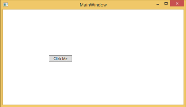
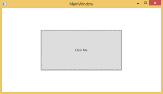
它们实际上是可分离的技术。要了解这是如何实现的,让我们看一个简单的示例,其中使用 XAML 中的某些属性创建按钮。
<Window x:Class = "WPFXAMLOverview.MainWindow"
   xmlns = "http://schemas.microsoft.com/winfx/2006/xaml/presentation"
   xmlns:x = "http://schemas.microsoft.com/winfx/2006/xaml"
   Title = "MainWindow" Height = "350" Width = "604">

   <StackPanel>
      <Button x:Name = "button" Content = "Click Me" HorizontalAlignment = "Left"
         Margin = "150" VerticalAlignment = "Top" Width = "75" />
   </StackPanel>

</Window>
如果您选择不在 WPF 中使用 XAML,那么您也可以使用过程语言实现相同的 GUI 结果。让我们看一下同一个例子,但是这一次,我们将在 C# 中创建一个按钮。
using System.Windows;
using System.Windows.Controls;

namespace WPFXAMLOverview {
   /// <summary>
      /// Interaction logic for MainWindow.xaml
   /// </summary>

   public partial class MainWindow : Window {

      public MainWindow() {
         InitializeComponent();

         // Create the StackPanel
         StackPanel stackPanel = new StackPanel();
         this.Content = stackPanel;

         // Create the Button
         Button button = new Button();
         button.Content = "Click Me";
         button.HorizontalAlignment = HorizontalAlignment.Left;
         button.Margin = new Thickness(150);
         button.VerticalAlignment = VerticalAlignment.Top;
         button.Width = 75;
         stackPanel.Children.Add(button);
      }
   }
}
当您编译并执行 XAML 代码或 C# 代码时,您将看到如下所示的相同输出。
从上面的示例中,很明显您可以在 XAML 中执行的操作来创建、初始化和设置对象的属性,同样的任务也可以使用代码来完成。
-
XAML 只是设计 UI 元素的另一种简单易行的方法。
-
使用 XAML,这并不意味着设计 UI 元素的方法是唯一的方法。您可以在 XAML 中声明对象或使用代码定义它们。
-
XAML 是可选的,但尽管如此,它仍是 WPF 设计的核心。
-
XAML 的目标是使可视化设计人员能够直接创建用户界面元素。
-
WPF 旨在通过标记来控制用户界面的所有视觉方面。
WPF – 元素树
有许多技术以树结构对元素和组件进行排序,以便程序员可以轻松处理对象并更改应用程序的行为。Windows Presentation Foundation (WPF) 具有对象形式的综合树结构。在 WPF 中,有两种方法可以概念化完整的对象树 –
- 逻辑树结构
- 可视化树结构
借助这些树结构,您可以轻松创建和识别 UI 元素之间的关系。大多数情况下,WPF 开发人员和设计人员要么使用过程语言创建应用程序,要么使用 XAML 设计应用程序的 UI 部分,同时牢记对象树结构。
逻辑树结构
在 WPF 应用程序中,XAML 中 UI 元素的结构表示逻辑树结构。在 XAML 中,UI 的基本元素由开发人员声明。WPF 中的逻辑树定义了以下内容 –
- 依赖属性
- 静态和动态资源
- 在其名称等上绑定元素。
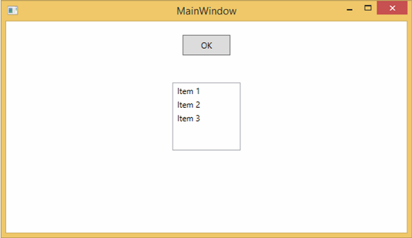
让我们看一下下面的示例,其中创建了一个按钮和一个列表框。
<Window x:Class = "WPFElementsTree.MainWindow"
   xmlns = "http://schemas.microsoft.com/winfx/2006/xaml/presentation"
   xmlns:x = "http://schemas.microsoft.com/winfx/2006/xaml"
   Title = "MainWindow" Height = "350" Width = "604">

   <StackPanel>
      <Button x:Name = "button" Height = "30" Width = "70" Content = "OK" Margin = "20" />

      <ListBox x:Name = "listBox" Height = "100" Width = "100" Margin = "20">
         <ListBoxItem Content = "Item 1" />
         <ListBoxItem Content = "Item 2" />
         <ListBoxItem Content = "Item 3" />
      </ListBox>

   </StackPanel>

</Window>
如果您查看 XAML 代码,您将观察到一种树结构,即根节点是 Window,根节点内部只有一个子节点,即 StackPanel。但是 StackPanel 包含两个子元素,按钮和列表框。列表框还有三个子列表框项。
可视化树结构
在 WPF 中,可视化树的概念描述了可视化对象的结构,如 Visual Base Class 所表示。它表示呈现到输出屏幕的所有 UI 元素。
当程序员想要为特定控件创建模板时,他实际上是在渲染该控件的可视化树。可视化树对于那些出于性能和优化原因想要绘制较低级别控件的人也非常有用。
在 WPF 应用程序中,可视化树用于 –
- 渲染视觉对象。
- 渲染布局。
- 路由事件主要沿着可视树而不是逻辑树传播。
要查看包含按钮和列表框的上述简单应用程序的可视化树,让我们编译并执行 XAML 代码,您将看到以下窗口。
当应用程序运行时,您可以在 Live Visual Tree 窗口中看到正在运行的应用程序的可视化树,显示了该应用程序的完整层次结构,如下所示。
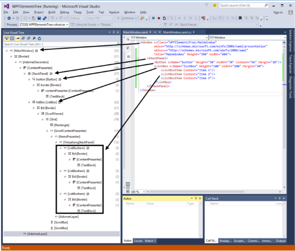
可视化树通常是逻辑树的超集。您可以在此处看到所有逻辑元素也都出现在可视化树中。所以这两个树实际上只是构成 UI 的同一组对象的两个不同视图。
-
逻辑树遗漏了很多细节,使您能够专注于用户界面的核心结构,而忽略它究竟是如何呈现的细节。
-
逻辑树用于创建用户界面的基本结构。
-
如果您专注于演示,可视化树将会很有趣。例如,如果您希望自定义任何 UI 元素的外观,您将需要使用可视化树。
WPF – 依赖属性
在 WPF 应用程序中,依赖属性是一种特定类型的属性,它扩展了 CLR 属性。它利用了 WPF 属性系统中可用的特定功能。
定义依赖属性的类必须从DependencyObject类继承。XAML 中使用的许多 UI 控件类都是从DependencyObject类派生的,它们支持依赖属性,例如 Button 类支持IsMouseOver依赖属性。
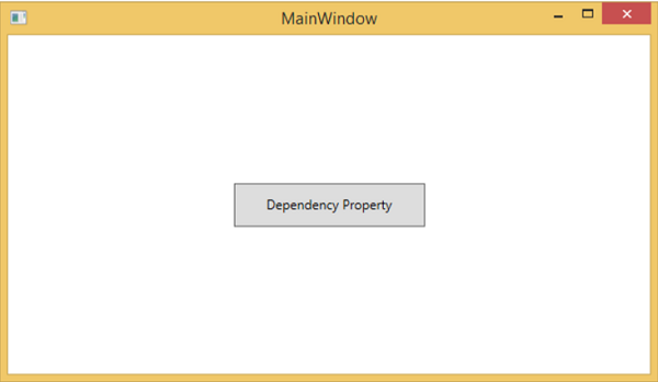
以下 XAML 代码创建一个具有某些属性的按钮。
<Window x:Class = "WPFDependencyProperty.MainWindow"
   xmlns = "http://schemas.microsoft.com/winfx/2006/xaml/presentation"
   xmlns:x = "http://schemas.microsoft.com/winfx/2006/xaml"
   xmlns:local = "clr-namespace:WPFDependencyProperty"
   Title = "MainWindow" Height = "350" Width = "604">

   <Grid>
      <Button  Height = "40" Width = "175" Margin = "10" Content = "Dependency Property">
         <Button.Style>
            <Style TargetType = "{x:Type Button}">
               <Style.Triggers>

                  <Trigger Property = "IsMouseOver" Value = "True">
                     <Setter Property = "Foreground" Value = "Red" />
                  </Trigger>

               </Style.Triggers>
            </Style>
         </Button.Style>
      </Button>
   </Grid>

</Window>
XAML 中的 x:Type 标记扩展具有与 C# 中的 typeof() 类似的功能。它在指定采用对象类型的属性时使用,例如 <Style TargetType = “{x:Type Button}”>
编译并执行上述代码后,您将获得以下MainWindow。当鼠标悬停在按钮上时,它将改变按钮的前景色。当鼠标离开按钮时,它会变回原来的颜色。
为什么我们需要依赖属性
当您在应用程序中使用依赖属性时,它会给您带来各种好处。依赖属性可以在以下场景中用于 CLR 属性 –
- 如果要设置样式
- 如果你想要数据绑定
- 如果要设置一个资源(静态或动态资源)
- 如果你想支持动画
基本上,依赖属性提供了许多使用 CLR 属性无法获得的功能。
下面列出了依赖属性和其他CLR 属性之间的主要区别–
-
CLR 属性可以通过使用getter和setter直接从类的私有成员读取/写入。相反,依赖属性不存储在本地对象中。
-
依赖属性存储在由 DependencyObject 类提供的键/值对字典中。它还节省了大量内存,因为它在更改时存储属性。它也可以在 XAML 中绑定。
自定义依赖属性
在 .NET 框架中,还可以定义自定义依赖属性。按照下面给出的步骤在 C# 中定义自定义依赖项属性。
-
使用系统调用寄存器声明并注册您的依赖属性。
-
提供属性的setter和getter。
-
定义一个静态处理程序,它将处理全局发生的任何更改
-
定义一个实例处理程序,它将处理该特定实例发生的任何更改。
下面的 C# 代码定义了一个依赖属性来设置用户控件的SetText属性。
using System;
using System.Collections.Generic;
using System.Linq;
using System.Text;
using System.Threading.Tasks;

using System.Windows;
using System.Windows.Controls;
using System.Windows.Data;
using System.Windows.Documents;
using System.Windows.Input;
using System.Windows.Media;
using System.Windows.Media.Imaging;
using System.Windows.Navigation;
using System.Windows.Shapes;

namespace WpfApplication3 {
   /// <summary>
      /// Interaction logic for UserControl1.xaml
   /// </summary>

   public partial class UserControl1 : UserControl {

      public UserControl1() {
         InitializeComponent();
      }

      public static readonly DependencyProperty SetTextProperty =
         DependencyProperty.Register("SetText", typeof(string), typeof(UserControl1), new
            PropertyMetadata("", new PropertyChangedCallback(OnSetTextChanged)));

      public string SetText {
         get { return (string)GetValue(SetTextProperty); }
         set { SetValue(SetTextProperty, value); }
      }

      private static void OnSetTextChanged(DependencyObject d,
         DependencyPropertyChangedEventArgs e) {
         UserControl1 UserControl1Control = d as UserControl1;
         UserControl1Control.OnSetTextChanged(e);
      }

      private void OnSetTextChanged(DependencyPropertyChangedEventArgs e) {
         tbTest.Text = e.NewValue.ToString();
      }
   }
}
这是 XAML 文件,其中 TextBlock 被定义为用户控件,并且 Text 属性将由 SetText 依赖属性分配给它。
以下 XAML 代码创建用户控件并初始化其SetText依赖项属性。
<Window x:Class = "WpfApplication3.MainWindow"
   xmlns = "http://schemas.microsoft.com/winfx/2006/xaml/presentation"
   xmlns:x = "http://schemas.microsoft.com/winfx/2006/xaml"
   xmlns:views = "clr-namespace:WpfApplication3"
   Title = "MainWindow" Height = "350" Width = "604">

   <Grid>
      <views:UserControl1 SetText = "Hellow World"/>
   </Grid>

</Window>
让我们运行这个应用程序。您可以立即观察到,在我们的 MainWindow 中,用户控件的依赖属性已成功用作 Text。
WPF – 路由事件
甲路由事件是事件的类型,可以调用上多个侦听处理程序中的一个元素树,而不是仅仅对引发事件的对象。它基本上是一个由路由事件类的实例支持的 CLR 事件。它在 WPF 事件系统中注册。RoutedEvents 具有三种主要的路由策略,如下所示 –
- 直接事件
- 冒泡事件
- 隧道事件
直接事件
直接事件类似于 Windows 窗体中的事件,这些事件由发起事件的元素引发。
与标准 CLR 事件不同,直接路由事件支持类处理,它们可以在自定义控件样式内的事件设置器和事件触发器中使用。
直接事件的一个很好的例子是 MouseEnter 事件。
冒泡事件
冒泡事件从事件发生的元素开始。然后它沿着可视化树向上移动到可视化树中的最顶层元素。因此,在 WPF 中,最顶层的元素很可能是一个窗口。
隧道事件
元素树根上的事件处理程序被调用,然后事件沿着可视化树向下传播到所有子节点,直到到达事件发生的元素。
冒泡事件和隧道事件之间的区别在于隧道事件总是以预览开始。
在 WPF 应用程序中,事件通常作为隧道/冒泡对实现。因此,您将有一个预览 MouseDown 和一个 MouseDown 事件。
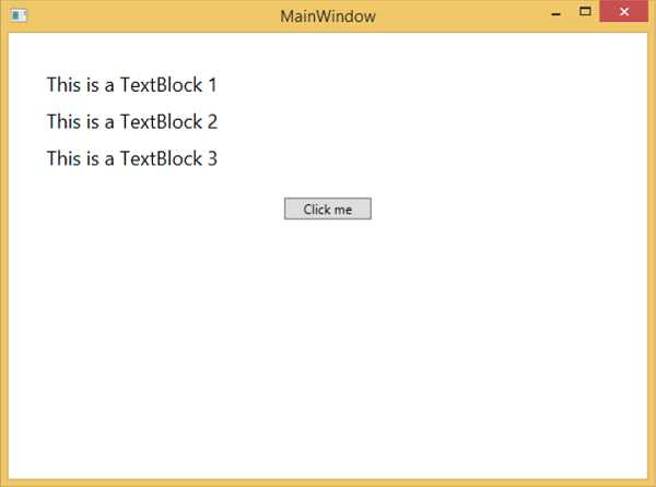
下面给出了一个简单的路由事件示例,其中使用一些属性和事件创建了一个按钮和三个文本块。
<Window x:Class = "WPFRoutedEvents.MainWindow"
   xmlns = "http://schemas.microsoft.com/winfx/2006/xaml/presentation"
   xmlns:x = "http://schemas.microsoft.com/winfx/2006/xaml"
   Title = "MainWindow" Height = "450" Width = "604" ButtonBase.Click  = "Window_Click" >

   <Grid>
      <StackPanel Margin = "20" ButtonBase.Click = "StackPanel_Click">

         <StackPanel Margin = "10">
            <TextBlock Name = "txt1" FontSize = "18" Margin = "5" Text = "This is a TextBlock 1" />
            <TextBlock Name = "txt2" FontSize = "18" Margin = "5" Text = "This is a TextBlock 2" />
            <TextBlock Name = "txt3" FontSize = "18" Margin = "5" Text = "This is a TextBlock 3" />
         </StackPanel>

         <Button Margin = "10" Content = "Click me" Click = "Button_Click" Width = "80"/>
      </StackPanel>
   </Grid>

</Window>
这是 Button、StackPanel 和 Window 的 Click 事件实现的 C# 代码。
using System.Windows;
namespace WPFRoutedEvents {
/// <summary>
/// Interaction logic for MainWindow.xaml
/// </summary>
public partial class MainWindow : Window {
public MainWindow() {
InitializeComponent();
}
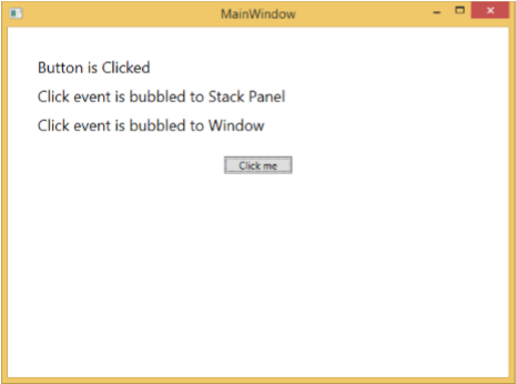
private void Button_Click(object sender, RoutedEventArgs e) {
txt1.Text = "Button is Clicked";
}
private void StackPanel_Click(object sender, RoutedEventArgs e) {
txt2.Text = "Click event is bubbled to Stack Panel";
}
private void Window_Click(object sender, RoutedEventArgs e) {
txt3.Text = "Click event is bubbled to Window";
}
}
}
当您编译并执行上述代码时,它将产生以下窗口 –
当您单击按钮时,文本块将更新,如下所示。
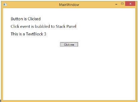
如果要在任何特定级别停止路由事件,则需要设置 e.Handled = true;
让我们更改StackPanel_Click事件,如下所示 –
private void StackPanel_Click(object sender, RoutedEventArgs e) {
   txt2.Text = "Click event is bubbled to Stack Panel";
   e.Handled = true;
}
当您单击按钮时,您会观察到单击事件不会被路由到窗口,而是会停在堆栈面板和 3rd 文本块不会更新。
自定义路由事件
在 .NET 框架中,也可以定义自定义路由事件。您需要按照下面给出的步骤在 C# 中定义自定义路由事件。
-
使用系统调用 RegisterRoutedEvent 声明并注册您的路由事件。
-
指定路由策略,即 Bubble、Tunnel 或 Direct。
-
提供事件处理程序。
让我们举个例子来了解更多关于自定义路由事件的信息。按照下面给出的步骤 –
-
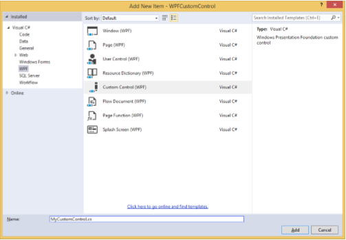
使用 WPFCustomRoutedEvent 创建一个新的 WPF 项目
-
右键单击您的解决方案,然后选择添加 > 新建项目…
-
将打开以下对话框,现在选择自定义控件 (WPF)并将其命名为MyCustomControl。
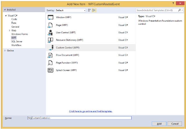
-
单击添加按钮,您将看到两个新文件(Themes/Generic.xaml 和 MyCustomControl.cs)将添加到您的解决方案中。
以下 XAML 代码为 Generic.xaml 文件中的自定义控件设置样式。
<ResourceDictionary
   xmlns = "http://schemas.microsoft.com/winfx/2006/xaml/presentation"
   xmlns:x = "http://schemas.microsoft.com/winfx/2006/xaml"
   xmlns:local = "clr-namespace:WPFCustomRoutedEvent">

   <Style TargetType = "{x:Type local:MyCustomControl}">
      <Setter Property = "Margin" Value = "50"/>
      <Setter Property = "Template">
         <Setter.Value>
            <ControlTemplate TargetType = "{x:Type local:MyCustomControl}">

               <Border Background = "{TemplateBinding Background}"
                  BorderBrush = "{TemplateBinding BorderBrush}"
                  BorderThickness = "{TemplateBinding BorderThickness}">
                  <Button x:Name = "PART_Button" Content = "Click Me" />
               </Border>

            </ControlTemplate>
         </Setter.Value>
      </Setter>
   </Style>

</ResourceDictionary>
下面给出的是MyCustomControl 类的 C# 代码,该类继承自Control 类,其中为自定义控件创建了自定义路由事件 Click。
using System.Windows;
using System.Windows.Controls;

namespace WPFCustomRoutedEvent {

   public class MyCustomControl : Control {

      static MyCustomControl() {
         DefaultStyleKeyProperty.OverrideMetadata(typeof(MyCustomControl),
            new FrameworkPropertyMetadata(typeof(MyCustomControl)));
      }

      public override void OnApplyTemplate() {
         base.OnApplyTemplate();

         //demo purpose only, check for previous instances and remove the handler first
         var button  =  GetTemplateChild("PART_Button") as Button;
         if (button ! =  null)
         button.Click + =  Button_Click;
      }

      void Button_Click(object sender, RoutedEventArgs e) {
         RaiseClickEvent();
      }

      public static readonly RoutedEvent ClickEvent  =
         EventManager.RegisterRoutedEvent("Click", RoutingStrategy.Bubble,
         typeof(RoutedEventHandler), typeof(MyCustomControl));

      public event RoutedEventHandler Click {
         add { AddHandler(ClickEvent, value); }
         remove { RemoveHandler(ClickEvent, value); }
      }

      protected virtual void RaiseClickEvent() {
         RoutedEventArgs args = new RoutedEventArgs(MyCustomControl.ClickEvent);
         RaiseEvent(args);
      }

   }
}
这是 C# 中的自定义路由事件实现,当用户单击它时将显示一个消息框。
using System.Windows;

namespace WPFCustomRoutedEvent {
   // <summary>
      // Interaction logic for MainWindow.xaml
   // </summary>

   public partial class MainWindow : Window {

      public MainWindow() {
         InitializeComponent();
      }

      private void MyCustomControl_Click(object sender, RoutedEventArgs e) {
         MessageBox.Show("It is the custom routed event of your custom control");
      }

   }
}
这是 MainWindow.xaml 中的实现,用于添加带有路由事件 Click 的自定义控件。
<Window x:Class = "WPFCustomRoutedEvent.MainWindow"
   xmlns = "http://schemas.microsoft.com/winfx/2006/xaml/presentation"
   xmlns:x = "http://schemas.microsoft.com/winfx/2006/xaml"
   xmlns:local = "clr-namespace:WPFCustomRoutedEvent"
   Title = "MainWindow" Height = "350" Width = "604">

   <Grid>
      <local:MyCustomControl Click = "MyCustomControl_Click" />
   </Grid>

</Window>
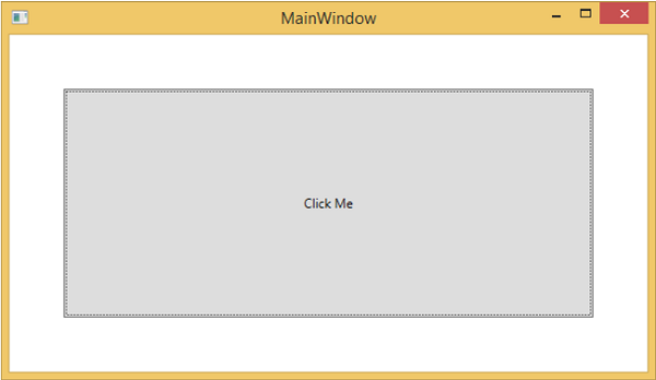
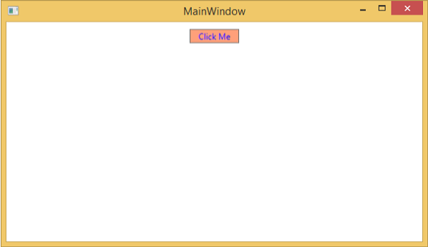
当上面的代码被编译和执行时,它会产生下面的窗口,其中包含一个自定义控件。
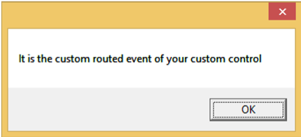
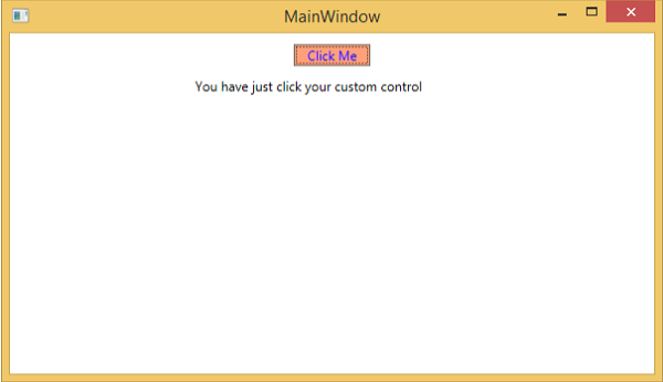
当您单击自定义控件时,它将产生以下消息。
WPF – 控件
Windows Presentation Foundation (WPF) 允许开发人员轻松构建和创建视觉丰富的基于 UI 的应用程序。
-
其他 UI 框架中的经典 UI 元素或控件也在 WPF 应用程序中得到了增强。
-
所有标准 WPF 控件都可以在工具箱中找到,该工具箱是 System.Windows.Controls 的一部分。
-
这些控件也可以用 XAML 标记语言创建。
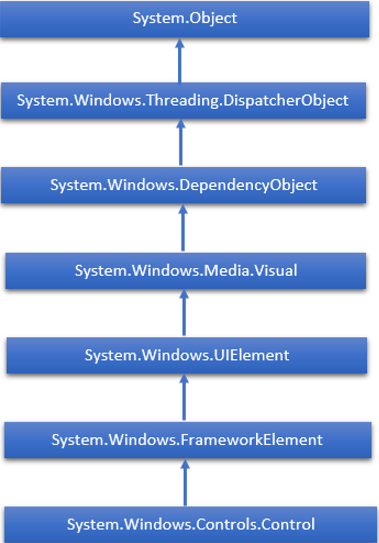
WPF 控件的完整继承层次结构如下 –
下表包含我们将在后续章节中讨论的控件列表。
| Sr. No. | 控制和描述 |
|---|---|
| 1 | Button
响应用户输入的控件 |
| 2 | Calendar
表示一个控件,该控件使用户能够使用可视日历显示来选择日期。 |
| 3 | CheckBox
用户可以选择或清除的控件。 |
| 4 | ComboBox
用户可以从中选择的项目的下拉列表。 |
| 5 | ContextMenu
获取或设置上下文菜单元素,每当通过用户界面 (UI) 从此元素内请求上下文菜单时,该元素应出现。 |
| 6 | DataGrid
表示在可自定义的网格中显示数据的控件。 |
| 7 | DatePicker
允许用户选择日期的控件。 |
| 8 | Dialogs
应用程序还可以显示附加窗口以帮助用户收集或显示重要信息。 |
| 9 | GridView
在可以水平滚动的行和列中显示项目集合的控件。 |
| 10 | Image
显示图像的控件。 |
| 11 | Label
在表单上显示文本。提供对访问密钥的支持。 |
| 12 | ListBox
显示用户可以从中选择的内联项目列表的控件。 |
| 13 | Menus
表示一个 Windows 菜单控件,它使您能够分层组织与命令和事件处理程序关联的元素。 |
| 14 | PasswordBox
用于输入密码的控件。 |
| 15 | Popup
在现有内容之上,在应用程序窗口的边界内显示内容。 |
| 16 | ProgressBar
通过显示条形指示进度的控件。 |
| 17 | RadioButton
允许用户从一组选项中选择一个选项的控件。 |
| 18 | ScrollViewer
允许用户平移和缩放其内容的容器控件。 |
| 19 | Slider
允许用户通过沿轨道移动 Thumb 控件从一系列值中进行选择的控件。 |
| 20 | TextBlock
显示文本的控件。 |
| 21 | ToggleButton
可以在两种状态之间切换的按钮。 |
| 22 | ToolTip
显示元素信息的弹出窗口。 |
| 23 | Window
提供最小化/最大化选项、标题栏、边框和关闭按钮的根窗口 |
| 24 | 3rd Party Controls
在 WPF 应用程序中使用第三方控件。 |
我们将一一讨论所有这些控件及其实现。
WPF – 布局
控件的布局对于应用程序的可用性非常重要和关键。它用于在您的应用程序中排列一组 GUI 元素。选择布局面板时需要考虑一些重要的事情 –
- 子元素的位置
- 子元素的大小
- 相互重叠的子元素的分层
当应用程序在不同的屏幕分辨率上运行时,控件的固定像素排列不起作用。XAML 提供了一组丰富的内置布局面板,以适当的方式排列 GUI 元素。一些最常用和流行的布局面板如下 –
| Sr. No. | 面板和说明 |
|---|---|
| 1 | Stack Panel
Stack panel 是一个简单而有用的 XAML 布局面板。在堆栈面板中,子元素可以根据方向属性水平或垂直排列在一行中。 |
| 2 | Wrap Panel
在 WrapPanel 中,子元素根据orientation 属性按顺序排列,从左到右或从上到下。 |
| 3 | Dock Panel
DockPanel 定义了一个区域来相对于彼此排列子元素,无论是水平还是垂直。使用 DockPanel,您可以使用Dock属性轻松地将子元素停靠到顶部、底部、右侧、左侧和中心。 |
| 4 | Canvas Panel
Canvas 面板是基本的布局面板,可以使用相对于Canvas任何一侧(例如左侧、右侧、顶部和底部)的坐标来明确定位子元素。 |
| 5 | Grid Panel
网格面板提供了一个由行和列组成的灵活区域。在 Grid 中,子元素可以以表格形式排列。 |
WPF – 布局嵌套
布局嵌套意味着在另一个布局内使用布局面板,例如在网格内定义堆栈面板。这个概念被广泛用于在应用程序中利用多个布局的优势。在以下示例中,我们将在网格内使用堆栈面板。
让我们看看下面的 XAML 代码。
<Window x:Class = "WPFNestingLayouts.MainWindow"
   xmlns = "http://schemas.microsoft.com/winfx/2006/xaml/presentation"
   xmlns:x = "http://schemas.microsoft.com/winfx/2006/xaml"
   xmlns:d = "http://schemas.microsoft.com/expression/blend/2008"
   xmlns:mc = "http://schemas.openxmlformats.org/markup-compatibility/2006"
   xmlns:local = "clr-namespace:WPFNestingLayouts"
   mc:Ignorable = "d" Title = "MainWindow" Height = "350" Width = "604">

   <Grid Background = "AntiqueWhite">
      <Grid.RowDefinitions>
         <RowDefinition Height = "*" />
         <RowDefinition Height = "*" />
         <RowDefinition Height = "*" />
         <RowDefinition Height = "*" />
         <RowDefinition Height = "*" />
      </Grid.RowDefinitions>

      <Grid.ColumnDefinitions>
         <ColumnDefinition Width = "*" />
      </Grid.ColumnDefinitions>

      <Label Content = "Employee Info" FontSize = "15"
         FontWeight = "Bold" Grid.Column = "0" Grid.Row = "0"/>

      <StackPanel Grid.Column = "0" Grid.Row = "1" Orientation = "Horizontal">
         <Label Content = "Name"  VerticalAlignment = "Center" Width = "70"/>
         <TextBox Name = "txtName" Text = "Muhammad Ali" VerticalAlignment = "Center"
            Width = "200">
         </TextBox>
      </StackPanel>

      <StackPanel Grid.Column = "0" Grid.Row = "2" Orientation = "Horizontal">
         <Label Content = "ID" VerticalAlignment = "Center" Width = "70"/>
         <TextBox Name = "txtCity" Text = "421" VerticalAlignment = "Center"
            Width = "50">
         </TextBox>
      </StackPanel>

      <StackPanel Grid.Column = "0" Grid.Row = "3" Orientation = "Horizontal">
         <Label Content = "Age" VerticalAlignment = "Center" Width = "70"/>
         <TextBox Name = "txtState" Text = "32" VerticalAlignment = "Center"
            Width = "50"></TextBox>
      </StackPanel>

      <StackPanel Grid.Column = "0" Grid.Row = "4" Orientation = "Horizontal">
         <Label Content = "Title" VerticalAlignment = "Center" Width = "70"/>
         <TextBox Name = "txtCountry" Text = "Programmer" VerticalAlignment = "Center"
            Width = "200"></TextBox>
      </StackPanel>

   </Grid>

</Window>
当您编译并执行上述代码时,将产生以下窗口。
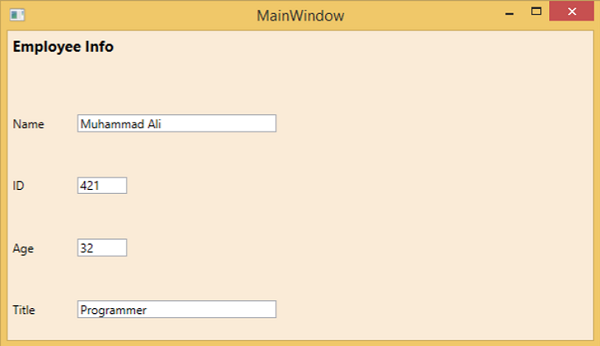
我们建议您执行上面的示例代码并尝试其他嵌套布局。
WPF – 输入
Windows Presentation Foundation (WPF) 提供了强大的 API,借助这些 API,应用程序可以从各种设备(如鼠标、键盘和触摸面板)获取输入。在本章中,我们将讨论以下可以在 WPF 应用程序中处理的输入类型 –
| Sr. No. | 输入和描述 |
|---|---|
| 1 | Mouse
有不同类型的鼠标输入,例如 MouseDown、MouseEnter、MouseLeave 等。 |
| 2 | Keyboard
键盘输入有多种类型,例如 KeyDown、KeyUp、TextInput 等。 |
| 3 | ContextMenu or RoutedCommands
RoutedCommands 支持在更语义级别的输入处理。这些实际上是简单的指令,如新建、打开、复制、剪切和保存。 |
| 4 | Multi Touch
Windows 7 及其更高版本能够接收来自多个触敏设备的输入。WPF 应用程序还可以通过在发生触摸时引发事件来将触摸输入作为其他输入(例如鼠标或键盘)进行处理。 |
WPF – 命令行
命令行参数是一种机制,用户可以在其中将一组参数或值传递给 WPF 应用程序执行时。这些参数对于从外部控制应用程序非常重要,例如,如果要从命令提示符打开 Word 文档,则可以使用此命令“ C:\> start winword word1.docx ”,它将打开word1 .docx文件。
命令行参数在启动函数中处理。以下是一个简单的示例,展示了如何将命令行参数传递给 WPF 应用程序。让我们创建一个名为WPFCommandLine的新 WPF 应用程序。
-
将一个文本框从工具箱拖到设计窗口。
-
在这个例子中,我们将一个 txt 文件路径作为命令行参数传递给我们的应用程序。
-
程序将读取 txt 文件,然后将所有文本写入文本框。
-
以下 XAML 代码创建一个文本框并使用一些属性对其进行初始化。
<Window x:Class = "WPFCommandLine.MainWindow"
   xmlns = "http://schemas.microsoft.com/winfx/2006/xaml/presentation"
   xmlns:x = "http://schemas.microsoft.com/winfx/2006/xaml"
   xmlns:d = "http://schemas.microsoft.com/expression/blend/2008"
   xmlns:mc = "http://schemas.openxmlformats.org/markup-compatibility/2006"
   xmlns:local = "clr-namespace:WPFCommandLine"
   mc:Ignorable = "d" Title = "MainWindow" Height = "350" Width = "525">

   <Grid>
      <TextBox x:Name = "textBox" HorizontalAlignment = "Left"
         Height = "180" Margin = "100" TextWrapping = "Wrap"
         VerticalAlignment = "Top" Width = "300"/>
   </Grid>

</Window>
- 现在订阅 App.xaml 文件中的 Startup 事件,如下所示。
<Application x:Class = "WPFCommandLine.App"
   xmlns = "http://schemas.microsoft.com/winfx/2006/xaml/presentation"
   xmlns:x = "http://schemas.microsoft.com/winfx/2006/xaml"
   xmlns:local = "clr-namespace:WPFCommandLine"
   StartupUri = "MainWindow.xaml" Startup = "app_Startup">

   <Application.Resources>

   </Application.Resources>

</Application>
-
下面给出的是 App.xaml.cs 中 app_Startup 事件的实现,它将获取命令行参数。
using System.Windows;

namespace WPFCommandLine {
   /// <summary>
      /// Interaction logic for App.xaml
   /// </summary>

   public partial class App : Application {
      public static string[] Args;

      void app_Startup(object sender, StartupEventArgs e) {
         // If no command line arguments were provided, don't process them
         if (e.Args.Length == 0) return;

         if (e.Args.Length > 0) {
            Args = e.Args;
         }
      }
   }
}
-
现在,在 MainWindow 类中,程序将打开 txt 文件并将所有文本写入文本框。
-
如果发现某些错误,则程序将在文本框中显示错误消息。
using System;
using System.IO;
using System.Windows;

namespace WPFCommandLine {

   public partial class MainWindow : Window {

      public MainWindow() {
         InitializeComponent();
         String[] args = App.Args;

         try {
            // Open the text file using a stream reader.
            using (StreamReader sr = new StreamReader(args[0])) {
               // Read the stream to a string, and write
               // the string to the text box
               String line = sr.ReadToEnd();
               textBox.AppendText(line.ToString());
               textBox.AppendText("\n");
            }
         }
         catch (Exception e) {
            textBox.AppendText("The file could not be read:");
            textBox.AppendText("\n");
            textBox.AppendText(e.Message);
         }
      }
   }
}
-
当上面的代码被编译和执行时,它会产生一个带有文本框的空白窗口,因为这个程序需要一个命令行参数。因此,Visual Studio 提供了一种使用命令行参数执行应用程序的简单方法。
-
在解决方案资源管理器中右键单击您的 WPF 项目并选择属性,它将显示以下窗口。
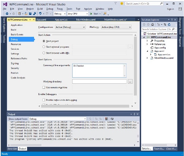
-
选择调试选项并在命令行参数中写入文件路径。
-
使用 Test.txt 创建一个 txt 文件并在该文件中写入一些文本并将其保存在任何位置。在这种情况下,txt 文件保存在“ D:\ ”硬盘上。
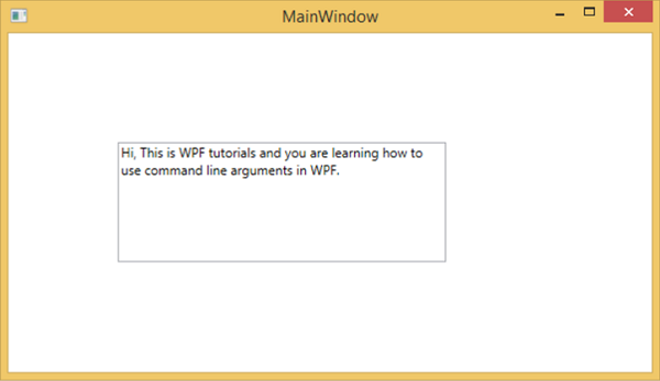
-
保存项目中的更改并立即编译和执行您的应用程序。您将在 TextBox 中看到程序从 Text.txt 文件中读取的文本。
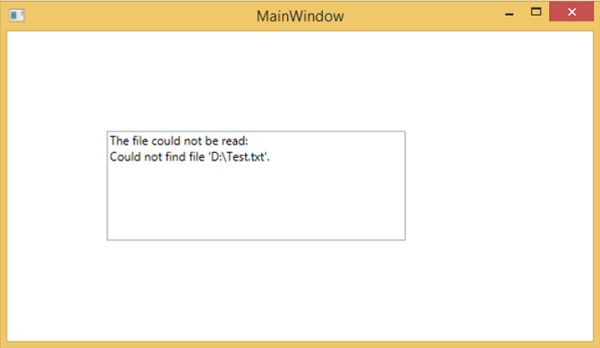
现在让我们尝试将您机器上的文件名从Test.txt更改为Test1.txt并再次执行您的程序,然后您将在文本框中看到该错误消息。
我们建议您执行上述代码并按照所有步骤成功执行您的应用程序。
WPF – 数据绑定
数据绑定是 WPF 应用程序中的一种机制,它为 Windows 运行时应用程序提供了一种简单易用的方式来显示数据并与数据交互。在这种机制中,数据的管理与数据的方式完全分离。
数据绑定允许数据在用户界面上的 UI 元素和数据对象之间流动。当建立绑定并且数据或您的业务模型发生变化时,它会自动将更新反映到 UI 元素,反之亦然。也可以不绑定到标准数据源,而是绑定到页面上的另一个元素。
数据绑定有两种类型 –单向数据绑定和双向数据绑定。
单向数据绑定
在单向绑定中,数据从其源(即保存数据的对象)绑定到其目标(即显示数据的对象)
-
我们举一个简单的例子来详细了解单向数据绑定。首先,创建一个名为WPFDataBinding的新 WPF 项目。
-
以下 XAML 代码创建两个标签、两个文本框和一个按钮,并使用一些属性对其进行初始化。
<Window x:Class = "WPFDataBinding.MainWindow"
   xmlns = "http://schemas.microsoft.com/winfx/2006/xaml/presentation"
   xmlns:x = "http://schemas.microsoft.com/winfx/2006/xaml"
   xmlns:d = "http://schemas.microsoft.com/expression/blend/2008"
   xmlns:mc = "http://schemas.openxmlformats.org/markup-compatibility/2006"
   xmlns:local = "clr-namespace:WPFDataBinding"
   mc:Ignorable = "d" Title = "MainWindow" Height = "350" Width = "604">

   <Grid>

      <Grid.RowDefinitions>
         <RowDefinition Height = "Auto" />
         <RowDefinition Height = "Auto" />
         <RowDefinition Height = "*" />
      </Grid.RowDefinitions>

      <Grid.ColumnDefinitions>
         <ColumnDefinition Width = "Auto" />
         <ColumnDefinition Width = "200" />
      </Grid.ColumnDefinitions>

      <Label Name = "nameLabel" Margin = "2">_Name:</Label>

      <TextBox Name = "nameText" Grid.Column = "1" Margin = "2"
         Text = "{Binding Name, Mode = OneWay}"/>

      <Label Name = "ageLabel" Margin = "2" Grid.Row = "1">_Age:</Label>

      <TextBox Name = "ageText" Grid.Column = "1" Grid.Row = "1" Margin = "2"
         Text = "{Binding Age, Mode = OneWay}"/>

      <StackPanel Grid.Row = "2" Grid.ColumnSpan = "2">
         <Button Content = "_Show..." Click="Button_Click" />
      </StackPanel>

   </Grid>
</Window>
-
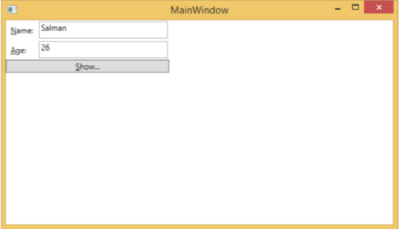
两个文本框的文本属性都绑定到“Name”和“Age”,它们是 Person 类的类变量,如下所示。
-
在 Person 类中,我们只有两个变量Name和Age,其对象在MainWindow类中初始化。
-
在 XAML 代码中,我们绑定到属性 Name 和 Age,但我们尚未选择该属性所属的对象。
-
更简单的方法是将一个对象分配给DataContext,我们在MainWindowconstructor中的以下 C# 代码中绑定其属性。
using System.Windows;
namespace WPFDataBinding {
public partial class MainWindow : Window {
Person person = new Person { Name = "Salman", Age = 26 };
public MainWindow() {
InitializeComponent();
this.DataContext = person;
}
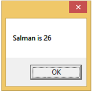
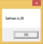
private void Button_Click(object sender, RoutedEventArgs e) {
string message = person.Name + " is " + person.Age;
MessageBox.Show(message);
}
}
public class Person {
private string nameValue;
public string Name {
get { return nameValue; }
set { nameValue = value; }
}
private double ageValue;
public double Age {
get { return ageValue; }
set {
if (value != ageValue) {
ageValue = value;
}
}
}
}
}
-
让我们运行这个应用程序,您可以立即在 MainWindow 中看到我们已成功绑定到该 Person 对象的 Name 和 Age 。
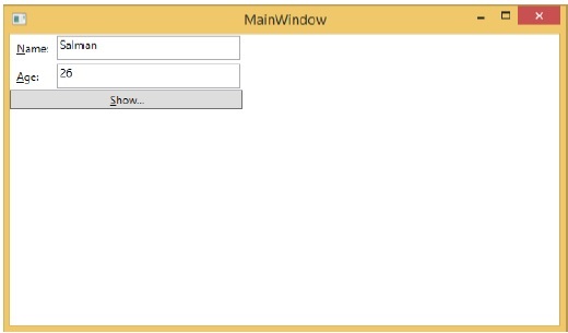
当您按下Show按钮时,它将在消息框中显示姓名和年龄。
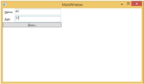
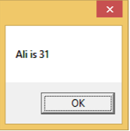
让我们在对话框中更改名称和年龄。
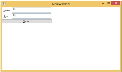
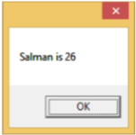
如果您现在单击“显示”按钮,它将再次显示相同的消息。
这是因为数据绑定模式在 XAML 代码中设置为单向。要显示更新的数据,您需要了解双向数据绑定。
双向数据绑定
在双向绑定中,用户可以通过用户界面修改数据并在源中更新该数据。如果在用户查看视图时源发生更改,您希望更新视图。
让我们以相同的示例为例,但在这里,我们将在 XAML 代码中将绑定模式从一种方式更改为两种方式。
<Window x:Class = "WPFDataBinding.MainWindow"
   xmlns = "http://schemas.microsoft.com/winfx/2006/xaml/presentation"
   xmlns:x = "http://schemas.microsoft.com/winfx/2006/xaml"
   xmlns:d = "http://schemas.microsoft.com/expression/blend/2008"
   xmlns:mc = "http://schemas.openxmlformats.org/markup-compatibility/2006"
   xmlns:local = "clr-namespace:WPFDataBinding"
   mc:Ignorable = "d" Title = "MainWindow" Height = "350" Width = "604">

   <Grid>

      <Grid.RowDefinitions>
         <RowDefinition Height = "Auto" />
         <RowDefinition Height = "Auto" />
         <RowDefinition Height = "*" />
      </Grid.RowDefinitions>

      <Grid.ColumnDefinitions>
         <ColumnDefinition Width = "Auto" />
         <ColumnDefinition Width = "200" />
      </Grid.ColumnDefinitions>

      <Label Name = "nameLabel" Margin = "2">_Name:</Label>
      <TextBox Name = "nameText" Grid.Column = "1" Margin = "2"
         Text = "{Binding Name, Mode = TwoWay}"/>
      <Label Name = "ageLabel" Margin = "2" Grid.Row = "1">_Age:</Label>
      <TextBox Name = "ageText" Grid.Column = "1" Grid.Row = "1" Margin = "2"
         Text = "{Binding Age, Mode = TwoWay}"/>

      <StackPanel Grid.Row = "2" Grid.ColumnSpan = "2">
         <Button Content = "_Show..." Click = "Button_Click" />
      </StackPanel>

   </Grid>

</Window>
让我们再次运行这个应用程序。
它将产生相同的输出 –
现在让我们更改 Name 和 Age 值 –
如果您现在单击“显示”按钮,它将显示更新的消息。
我们建议您在两种情况下都执行上述代码,以便更好地理解该概念。
WPF – 资源
资源通常是与某个对象相关联的定义,这些对象只是您预计会经常使用不止一次。它能够在本地为控件或当前窗口或为整个应用程序全局存储数据。
将对象定义为资源允许我们从另一个地方访问它。这意味着该对象可以被重用。资源在资源字典中定义,任何对象都可以定义为资源,有效地使其成为可共享的资产。为 XAML 资源指定了唯一键,使用该键,可以使用 StaticResource 标记扩展来引用它。
资源可以有两种类型 –
- 静态资源
- 动态资源
StaticResource 是一次性查找,而 DynamicResource 更像是数据绑定。它记住一个属性与一个特定的资源键相关联。如果与该键关联的对象发生变化,动态资源将更新目标属性。
例子
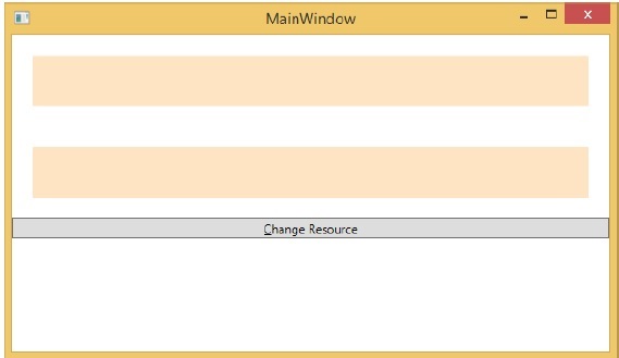
这是 SolidColorBrush 资源的简单应用程序。
-
让我们创建一个名为WPFResouces的新 WPF 项目。
-
拖动两个矩形并设置它们的属性,如以下 XAML 代码所示。
<Window x:Class = "WPFResources.MainWindow"
   xmlns = "http://schemas.microsoft.com/winfx/2006/xaml/presentation"
   xmlns:x = "http://schemas.microsoft.com/winfx/2006/xaml"
   xmlns:d = "http://schemas.microsoft.com/expression/blend/2008"
   xmlns:mc = "http://schemas.openxmlformats.org/markup-compatibility/2006"
   xmlns:local = "clr-namespace:WPFResources"
   mc:Ignorable = "d" Title = "MainWindow" Height = "350" Width = "525">

   <Window.Resources>
      <SolidColorBrush x:Key = "brushResource" Color = "Blue" />
   </Window.Resources>

   <StackPanel>
      <Rectangle Height = "50" Margin = "20" Fill = "{StaticResource brushResource}" />
      <Rectangle Height = "50" Margin = "20" Fill = "{DynamicResource brushResource}" />
      <Button x:Name = "changeResourceButton"
         Content = "_Change Resource" Click = "changeResourceButton_Click" />
   </StackPanel>

</Window>
-
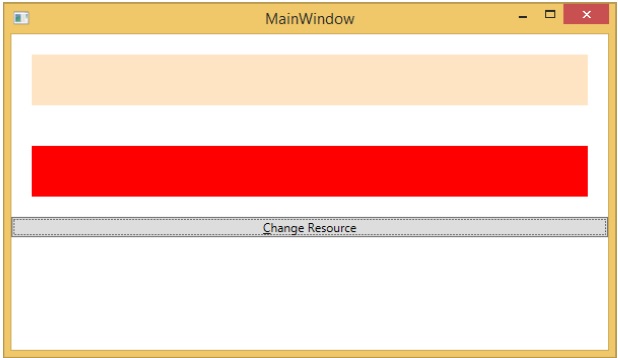
在上面的XAML代码中,可以看到一个矩形有StaticResource,另一个矩形有DynamicResource,并且brushResource的颜色是Bisque。
-
当您编译并执行代码时,它会生成以下 MainWindow。
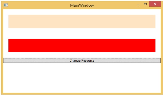
当您单击“更改资源”按钮时,您将看到带有 DynamicResource 的矩形将其颜色更改为红色。
资源范围
资源在资源字典中定义,但是有很多地方可以定义资源字典。在上面的例子中,资源字典是在窗口/页面级别定义的。在哪个字典中定义资源会立即限制该资源的范围。因此范围,即您可以在何处使用资源,取决于您定义它的位置。
-
在网格的资源字典中定义资源,并且只能由该网格及其子元素访问。
-
在窗口/页面上定义它,并且该窗口/页面上的所有元素都可以访问它。
-
应用根可以在 App.xaml 资源字典中找到。它是我们应用程序的根,因此这里定义的资源范围是整个应用程序。
就资源的范围而言,最常见的是应用程序级别、页面级别和特定元素级别,如 Grid、StackPanel 等。
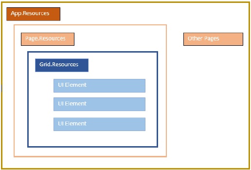
上述应用程序在其窗口/页面级别具有资源。
资源词典
XAML 应用程序中的资源字典意味着资源字典保存在单独的文件中。几乎所有 XAML 应用程序都遵循它。在单独的文件中定义资源具有以下优点 –
-
资源字典中定义资源与UI相关代码的分离。
-
在单独的文件(例如 App.xaml)中定义所有资源将使它们在整个应用程序中可用。
那么,我们如何在单独文件中的资源字典中定义我们的资源?嗯,这很容易,只需按照以下步骤通过 Visual Studio 添加一个新的资源字典 –
-
在您的解决方案中,添加一个新文件夹并将其命名为ResourceDictionaries。
-
右键单击此文件夹并从添加子菜单项中选择资源字典并将其命名为DictionaryWithBrush.xaml
例子
现在让我们以相同的示例为例,但在这里,我们将在应用程序级别定义资源字典。MainWindow.xaml 的 XAML 代码如下 –
<Window x:Class = "WPFResources.MainWindow"
   xmlns = "http://schemas.microsoft.com/winfx/2006/xaml/presentation"
   xmlns:x = "http://schemas.microsoft.com/winfx/2006/xaml"
   xmlns:d = "http://schemas.microsoft.com/expression/blend/2008"
   xmlns:mc = "http://schemas.openxmlformats.org/markup-compatibility/2006"
   xmlns:local = "clr-namespace:WPFResources"
   mc:Ignorable = "d" Title = "MainWindow" Height = "350" Width = "525">

   <StackPanel>
      <Rectangle Height = "50" Margin = "20" Fill = "{StaticResource brushResource}" />
      <Rectangle Height = "50" Margin = "20" Fill = "{DynamicResource brushResource}" />
      <Button x:Name = "changeResourceButton"
         Content = "_Change Resource" Click = "changeResourceButton_Click" />
   </StackPanel>

</Window>
这是 DictionaryWithBrush.xaml 中的实现 –
<ResourceDictionary xmlns = "http://schemas.microsoft.com/winfx/2006/xaml/presentation"
   xmlns:x = "http://schemas.microsoft.com/winfx/2006/xaml">
   <SolidColorBrush x:Key = "brushResource" Color = "Blue" />
</ResourceDictionary>
这是 app.xaml 中的实现 –
<Application x:Class="WPFResources.App"
   xmlns = "http://schemas.microsoft.com/winfx/2006/xaml/presentation"
   xmlns:x = "http://schemas.microsoft.com/winfx/2006/xaml"
   StartupUri = "MainWindow.xaml">

   <Application.Resources>
      <ResourceDictionary Source = " XAMLResources\ResourceDictionaries\DictionaryWithBrush.xaml"/>
   </Application.Resources>

</Application>
当上面的代码被编译和执行时,它会产生以下输出 –
当您单击更改资源按钮时,矩形将其颜色更改为红色。
我们建议您执行上述代码并尝试更多资源(例如,背景颜色)。
WPF – 模板
模板描述了控件的整体外观和视觉外观。对于每个控件,都有一个与之关联的默认模板,它赋予控件外观。在 WPF 应用程序中,当您想要自定义控件的视觉行为和视觉外观时,您可以轻松创建自己的模板。
逻辑和模板之间的连接可以通过数据绑定来实现。下面列出了样式和模板之间的主要区别–
-
样式只能使用该控件的默认属性更改控件的外观。
-
使用模板,您可以访问控件的更多部分而不是样式。您还可以指定控件的现有行为和新行为。
有两种最常用的模板 –
- 控制模板
- 数据模板
控制模板
控件模板定义控件的视觉外观。所有的 UI 元素都具有某种外观和行为,例如,按钮具有外观和行为。单击事件或鼠标悬停事件是响应单击和悬停而触发的行为,并且还有一个按钮的默认外观,可以通过控制模板进行更改。
例子
我们举一个简单的例子。我们将创建两个按钮(一个是模板,另一个是默认按钮)并用一些属性初始化它们。
<Window x:Class = "TemplateDemo.MainWindow"
   xmlns = "http://schemas.microsoft.com/winfx/2006/xaml/presentation"
   xmlns:x = "http://schemas.microsoft.com/winfx/2006/xaml"
   Title = "MainWindow" Height = "350" Width = "604">

   <Window.Resources>
      <ControlTemplate x:Key = "ButtonTemplate" TargetType = "Button">

         <Grid>
            <Ellipse x:Name = "ButtonEllipse" Height = "100" Width = "150" >
               <Ellipse.Fill>
                  <LinearGradientBrush StartPoint = "0,0.2" EndPoint = "0.2,1.4">
                     <GradientStop Offset = "0" Color = "Red" />
                     <GradientStop Offset = "1" Color = "Orange" />
                  </LinearGradientBrush>
               </Ellipse.Fill>
            </Ellipse>

            <ContentPresenter Content = "{TemplateBinding Content}"
               HorizontalAlignment = "Center" VerticalAlignment = "Center" />
         </Grid>

         <ControlTemplate.Triggers>

            <Trigger Property = "IsMouseOver" Value = "True">
               <Setter TargetName = "ButtonEllipse" Property = "Fill" >
                  <Setter.Value>
                     <LinearGradientBrush StartPoint = "0,0.2" EndPoint = "0.2,1.4">
                        <GradientStop Offset = "0" Color = "YellowGreen" />
                        <GradientStop Offset = "1" Color = "Gold" />
                     </LinearGradientBrush>
                  </Setter.Value>
               </Setter>
            </Trigger>

            <Trigger Property = "IsPressed" Value = "True">
               <Setter Property = "RenderTransform">
                  <Setter.Value>
                     <ScaleTransform ScaleX = "0.8" ScaleY = "0.8"
                        CenterX = "0" CenterY = "0"  />
                  </Setter.Value>
               </Setter>
               <Setter Property = "RenderTransformOrigin" Value = "0.5,0.5" />
            </Trigger>

         </ControlTemplate.Triggers>

      </ControlTemplate>
   </Window.Resources>

   <StackPanel>
      <Button Content = "Round Button!"
         Template = "{StaticResource ButtonTemplate}"
         Width = "150" Margin = "50" />
      <Button Content = "Default Button!" Height = "40"
         Width = "150" Margin = "5" />
   </StackPanel>

</Window>
当您编译并执行上述代码时,会显示如下 MainWindow。
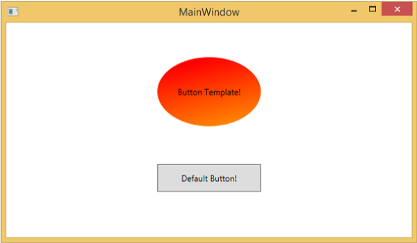
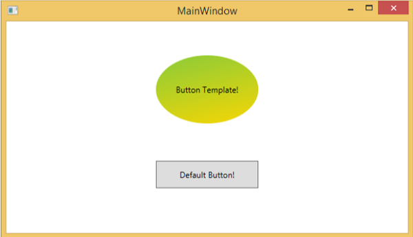
当您将鼠标移到带有自定义模板的按钮上时,它会改变其颜色,如下所示。
数据模板
数据模板定义并指定数据集合的外观和结构。它提供了在任何 UI 元素上格式化和定义数据表示的灵活性。多用于数据相关的Item控件,如ComboBox、ListBox等。
例子
-
我们通过一个简单的例子来理解数据模板的概念。创建一个名为WPFDataTemplates的新 WPF 项目。
-
在以下 XAML 代码中,我们将创建一个数据模板作为资源来保存标签和文本框。还有一个按钮和一个列表框来显示数据。
<Window x:Class = "WPFDataTemplates.MainWindow"
   xmlns = "http://schemas.microsoft.com/winfx/2006/xaml/presentation"
   xmlns:x = "http://schemas.microsoft.com/winfx/2006/xaml"
   xmlns:d = "http://schemas.microsoft.com/expression/blend/2008"
   xmlns:mc = "http://schemas.openxmlformats.org/markup-compatibility/2006"
   xmlns:local = "clr-namespace:WPFDataTemplates"
   xmlns:loc = "clr-namespace:WPFDataTemplates"
   mc:Ignorable = "d" Title = "MainWindow" Height = "350" Width = "525">

   <Window.Resources>
      <DataTemplate DataType = "{x:Type loc:Person}">

         <Grid>
            <Grid.RowDefinitions>
               <RowDefinition Height = "Auto" />
               <RowDefinition Height = "Auto" />
            </Grid.RowDefinitions>

            <Grid.ColumnDefinitions>
               <ColumnDefinition Width = "Auto" />
               <ColumnDefinition Width = "200" />
            </Grid.ColumnDefinitions>

            <Label Name = "nameLabel" Margin = "10"/>
            <TextBox Name = "nameText" Grid.Column = "1" Margin = "10"
               Text = "{Binding Name}"/>
            <Label Name = "ageLabel" Margin = "10" Grid.Row = "1"/>
            <TextBox Name = "ageText" Grid.Column = "1" Grid.Row = "1" Margin = "10"
               Text = "{Binding Age}"/>
         </Grid>

      </DataTemplate>
   </Window.Resources>

   <Grid>
      <Grid.RowDefinitions>
         <RowDefinition Height = "Auto" />
         <RowDefinition Height = "*" />
      </Grid.RowDefinitions>

      <ListBox ItemsSource = "{Binding}" />
      <StackPanel Grid.Row = "1" >
         <Button Content = "_Show..." Click = "Button_Click" Width = "80" HorizontalAlignment = "Left" Margin = "10"/>
      </StackPanel>

   </Grid>

</Window>
这是C#中的实现,其中将 Person 对象列表分配给 DataContext、Person 类和按钮单击事件的实现。
using System.Collections.Generic;
using System.Windows;

namespace WPFDataTemplates {

   public partial class MainWindow : Window {

      Person src = new Person { Name = "Ali", Age = 27 };
      List<Person> people = new List<Person>();

      public MainWindow() {
         InitializeComponent();
         people.Add(src);
         people.Add(new Person { Name = "Mike", Age = 62 });
         people.Add(new Person { Name = "Brian", Age = 12 });
         this.DataContext = people;
      }

      private void Button_Click(object sender, RoutedEventArgs e) {
         string message = src.Name + " is " + src.Age;
         MessageBox.Show(message);
      }
   }

   public class Person {
      private string nameValue;

      public string Name {
         get { return nameValue; }
         set { nameValue = value; }
      }

      private double ageValue;

      public double Age {
         get { return ageValue; }
         set {
            if (value != ageValue) {
            ageValue = value;
            }
         }
      }
   }

}
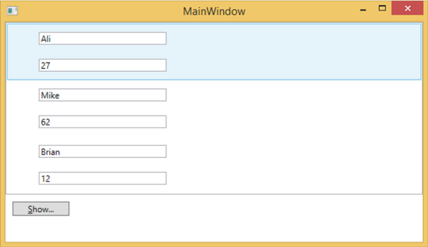
当您编译并执行上述代码时,将产生以下窗口。它包含一个列表,在列表框内,每个列表框项都包含显示在标签和文本框上的 Person 类对象数据。
WPF – 样式
.NET 框架提供了多种策略来个性化和自定义应用程序的外观。样式使我们能够灵活地设置对象的某些属性,并在多个对象中重用这些特定设置以获得一致的外观。
-
在样式中,您只能设置对象的现有属性,例如高度、宽度、字体大小等。
-
只能指定控件的默认行为。
-
可以将多个属性添加到单个样式中。
样式用于为一组控件提供统一的外观或外观。隐式样式用于将外观应用于给定类型的所有控件并简化应用程序。想象一下三个按钮,它们都必须看起来相同,相同的宽度和高度,相同的字体大小,相同的前景色等。我们可以在按钮元素本身上设置所有这些属性,这对于所有按钮来说仍然很好。看看下面的图表。
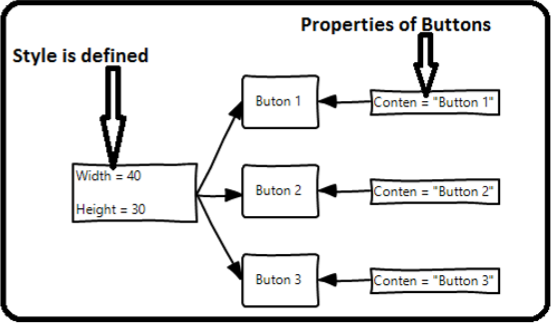
但在现实生活中的应用程序中,您通常会有更多这些需要看起来完全相同的。当然不仅是按钮,您通常还希望您的文本块、文本框和组合框等在您的应用程序中看起来相同。当然,必须有更好的方法来实现这一点,它被称为造型。您可以将样式视为将一组属性值应用于多个元素的便捷方式。看看下面的图表。
例子
让我们举一个简单的例子来理解这个概念。首先创建一个新的 WPF 项目。
-
将三个按钮从工具箱拖到设计窗口。
-
以下 XAML 代码创建三个按钮并使用一些属性初始化它们。
<Window x:Class = "WPFStyle.MainWindow"
xmlns = "http://schemas.microsoft.com/winfx/2006/xaml/presentation"
xmlns:x = "http://schemas.microsoft.com/winfx/2006/xaml"
xmlns:d = "http://schemas.microsoft.com/expression/blend/2008"
xmlns:mc = "http://schemas.openxmlformats.org/markup-compatibility/2006"
xmlns:local = "clr-namespace: WPFStyle"
mc:Ignorable = "d" Title = "MainWindow" Height = "350" Width = "604">
<StackPanel>
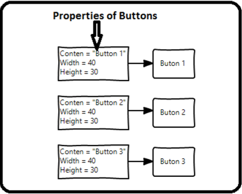
<Button Content = "Button1" Height = "30" Width = "80"
Foreground = "Blue" FontSize = "12" Margin = "10"/>
<Button Content = "Button2" Height = "30" Width = "80"
Foreground = "Blue" FontSize = "12" Margin = "10"/>
<Button Content = "Button3" Height = "30" Width = "80"
Foreground = "Blue" FontSize = "12" Margin = "10"/>
</StackPanel>
</Window>
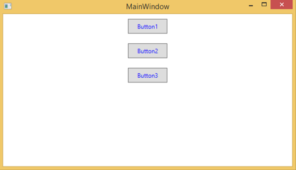
当您查看上面的代码时,您会发现所有按钮的高度、宽度、前景色、字体大小和边距属性都是相同的。现在,当上面的代码被编译并执行时,将显示以下窗口。
现在让我们看一下同一个例子,但这次,我们将使用style。
<Window x:Class = "XAMLStyle.MainWindow"
   xmlns = "http://schemas.microsoft.com/winfx/2006/xaml/presentation"
   xmlns:x = "http://schemas.microsoft.com/winfx/2006/xaml"
   xmlns:d = "http://schemas.microsoft.com/expression/blend/2008"
   xmlns:mc = "http://schemas.openxmlformats.org/markup-compatibility/2006"
   xmlns:local = "clr-namespace:XAMLStyle"
   mc:Ignorable = "d" Title = "MainWindow" Height = "350" Width = "604">

   <Window.Resources>
      <Style x:Key = "myButtonStyle" TargetType = "Button">
         <Setter Property = "Height" Value = "30" />
         <Setter Property = "Width" Value = "80" />
         <Setter Property = "Foreground" Value = "Blue" />
         <Setter Property = "FontSize" Value = "12" />
         <Setter Property = "Margin" Value = "10" />
      </Style>
   </Window.Resources>

   <StackPanel>
      <Button Content = "Button1" Style = "{StaticResource myButtonStyle}" />
      <Button Content = "Button2" Style = "{StaticResource myButtonStyle}" />
      <Button Content = "Button3" Style="{StaticResource myButtonStyle}" />
   </StackPanel>

</Window>
样式在资源字典中定义,每个样式都有唯一的键标识符和目标类型。在 <style> 中,您可以看到为将包含在样式中的每个属性定义了多个 setter 标记。
在上面的例子中,每个按钮的所有公共属性现在都在 style 中定义,然后通过 StaticResource 标记扩展设置 style 属性,将样式分配给具有唯一键的每个按钮。
当您编译并执行上述代码时,将显示以下窗口(输出相同)。
这样做的好处是显而易见的,我们可以在其范围内的任何地方重用该样式;如果我们需要更改它,我们只需在样式定义中更改一次,而不是在每个元素上更改。
在什么级别上定义样式会立即限制该样式的范围。因此范围,即您可以在何处使用样式,取决于您定义它的位置。可以在以下级别定义样式 –
| Sr.No | 级别和描述 |
|---|---|
| 1 | Control Level
在控件级别定义样式只能应用于该特定控件。下面给出了一个控件级别的示例,其中按钮和 TextBlock 具有自己的样式。 |
| 2 | Layout Level
在任何布局级别定义样式将使其只能由该布局及其子元素访问。 |
| 3 | Window Level
在窗口级别定义样式可以使该窗口上的所有元素都可以访问它。 |
| 4 | Application Level
在应用程序级别定义样式可以使其在整个应用程序中都可以访问。让我们以相同的示例为例,但在这里,我们将把样式放在 app.xaml 文件中,以使其在整个应用程序中都可以访问。 |
WPF – 触发器
触发器基本上使您能够更改属性值或根据属性值执行操作。因此,它允许您动态更改控件的外观和/或行为,而无需创建新控件。
当满足某些条件时,触发器用于更改任何给定属性的值。触发器通常在应用于该特定控件的样式或文档根中定义。有三种类型的触发器 –
- 属性触发器
- 数据触发器
- 事件触发器
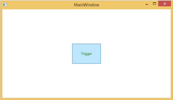
属性触发器
在属性触发器中,当一个属性发生更改时,它会立即或动画更改另一个属性。例如,当鼠标悬停在按钮上时,您可以使用属性触发器来更改按钮的外观。
以下示例代码显示了如何在鼠标悬停在按钮上时更改按钮的前景色。
<Window x:Class = "WPFPropertyTriggers.MainWindow"
   xmlns = "http://schemas.microsoft.com/winfx/2006/xaml/presentation"
   xmlns:x = "http://schemas.microsoft.com/winfx/2006/xaml"
   Title = "MainWindow" Height = "350" Width = "604">

   <Window.Resources>
      <Style x:Key = "TriggerStyle" TargetType = "Button">
         <Setter Property = "Foreground" Value = "Blue" />
         <Style.Triggers>
            <Trigger Property = "IsMouseOver" Value = "True">
               <Setter Property = "Foreground" Value = "Green" />
            </Trigger>
         </Style.Triggers>
      </Style>
   </Window.Resources>

   <Grid>
      <Button Width = "100" Height = "70"
         Style = "{StaticResource TriggerStyle}" Content = "Trigger"/>
   </Grid>

</Window>
当您编译并执行上述代码时,它将产生以下窗口 –
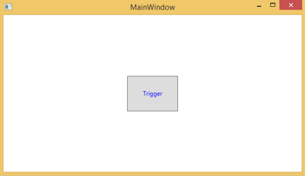
当鼠标悬停在按钮上时,其前景色将变为绿色。
数据触发器
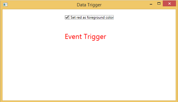
当绑定的数据满足某些条件时,数据触发器会执行某些操作。让我们看一下以下 XAML 代码,其中使用一些属性创建了一个复选框和一个文本块。当复选框被选中时,它会将其前景色更改为红色。
<Window x:Class = "WPFDataTrigger.MainWindow"
   xmlns = "http://schemas.microsoft.com/winfx/2006/xaml/presentation"
   xmlns:x = "http://schemas.microsoft.com/winfx/2006/xaml"
   Title = "Data Trigger" Height = "350" Width = "604">

   <StackPanel HorizontalAlignment = "Center">
      <CheckBox x:Name = "redColorCheckBox"
         Content = "Set red as foreground color" Margin = "20"/>

      <TextBlock Name = "txtblock" VerticalAlignment = "Center"
         Text = "Event Trigger" FontSize = "24" Margin = "20">
         <TextBlock.Style>
            <Style>
               <Style.Triggers>
                  <DataTrigger Binding = "{Binding ElementName = redColorCheckBox, Path = IsChecked}"
                     Value = "true">
                     <Setter Property = "TextBlock.Foreground" Value = "Red"/>
                     <Setter Property = "TextBlock.Cursor" Value = "Hand" />
                  </DataTrigger>
               </Style.Triggers>
            </Style>
         </TextBlock.Style>
      </TextBlock>

   </StackPanel>

</Window>
当上面的代码被编译和执行时,它会产生以下输出 –
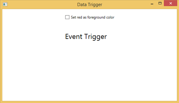
当您勾选复选框时,文本块将其前景色更改为红色。
事件触发器
当特定事件被触发时,事件触发器会执行一些操作。它通常用于在控件上完成一些动画,例如 DoubleAnumatio、ColorAnimation 等。在下面的示例中,我们将创建一个简单的按钮。当点击事件被触发时,它将扩展按钮的宽度和高度。
<Window x:Class = "WPFEventTrigger.MainWindow"
   xmlns = "http://schemas.microsoft.com/winfx/2006/xaml/presentation"
   xmlns:x = "http://schemas.microsoft.com/winfx/2006/xaml"
   Title = "MainWindow" Height = "350" Width = "604">

   <Grid>
      <Button Content = "Click Me" Width = "60" Height = "30">

         <Button.Triggers>
            <EventTrigger RoutedEvent = "Button.Click">
               <EventTrigger.Actions>
                  <BeginStoryboard>
                     <Storyboard>

                        <DoubleAnimationUsingKeyFrames Storyboard.TargetProperty =
                           "Width" Duration = "0:0:4">
                           <LinearDoubleKeyFrame Value = "60" KeyTime = "0:0:0"/>
                           <LinearDoubleKeyFrame Value = "120" KeyTime = "0:0:1"/>
                           <LinearDoubleKeyFrame Value = "200" KeyTime = "0:0:2"/>
                           <LinearDoubleKeyFrame Value = "300" KeyTime = "0:0:3"/>
                        </DoubleAnimationUsingKeyFrames>

                        <DoubleAnimationUsingKeyFrames Storyboard.TargetProperty = "Height"
                           Duration = "0:0:4">
                           <LinearDoubleKeyFrame Value = "30" KeyTime = "0:0:0"/>
                           <LinearDoubleKeyFrame Value = "40" KeyTime = "0:0:1"/>
                           <LinearDoubleKeyFrame Value = "80" KeyTime = "0:0:2"/>
                           <LinearDoubleKeyFrame Value = "150" KeyTime = "0:0:3"/>
                        </DoubleAnimationUsingKeyFrames>

                     </Storyboard>
                  </BeginStoryboard>
               </EventTrigger.Actions>
            </EventTrigger>
         </Button.Triggers>

      </Button>
   </Grid>

</Window>
当您编译并执行上述代码时,它将产生以下窗口 –
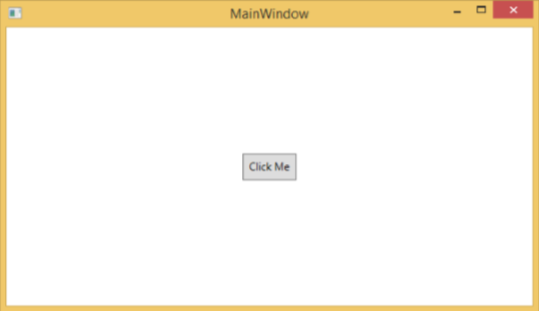
单击该按钮后,您将观察到它将开始在两个维度上扩展。
我们建议您编译并执行上述示例,并将触发器也应用于其他属性。
WPF – 调试
它是一种系统机制,用于识别和修复一段代码中与您期望的行为不同的错误或缺陷。调试子系统紧密耦合的复杂应用程序并不容易,因为修复一个子系统中的错误可能会在另一个子系统中创建错误。
在 C# 中调试
在 WPF 应用程序中,程序员处理两种语言,例如 C# 和 XAML。如果您熟悉使用任何过程语言(例如 C# 或 C/C++)进行调试,并且还知道断点的用法,那么您可以轻松调试应用程序的 C# 部分。
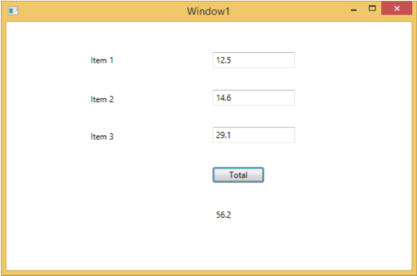
让我们举一个简单的例子来演示如何调试 C# 代码。创建一个名为WPFDebuggingDemo的新 WPF 项目。从工具箱中拖动四个标签、三个文本框和一个按钮。查看以下 XAML 代码。
<Window x:Class = "WPFDebuggingDemo.Window1"
   xmlns = "http://schemas.microsoft.com/winfx/2006/xaml/presentation"
   xmlns:x = "http://schemas.microsoft.com/winfx/2006/xaml"
   Title = "Window1" Height = "400" Width = "604">

   <Grid>
      <TextBox Height = "23" Margin = "0,44,169,0" Name = "textBox1"
         VerticalAlignment = "Top" HorizontalAlignment = "Right" Width = "120" />

      <TextBox Height = "23" Margin = "0,99,169,0" Name = "textBox2"
         VerticalAlignment = "Top" HorizontalAlignment = "Right" Width = "120" />

      <TextBox HorizontalAlignment = "Right" Margin = "0,153,169,0"
         Name = "textBox3" Width = "120" Height = "23" VerticalAlignment = "Top" />

      <Label Height = "28" Margin = "117,42,0,0" Name = "label1"
         VerticalAlignment = "Top" HorizontalAlignment = "Left" Width = "120">
         Item 1</Label>

      <Label Height = "28" HorizontalAlignment = "Left"
         Margin = "117,99,0,0" Name = "label2" VerticalAlignment = "Top" Width = "120">
         Item 2</Label>

      <Label HorizontalAlignment = "Left" Margin = "117,153,0,181"
         Name = "label3" Width = "120">Item 3</Label>

      <Button Height = "23" HorizontalAlignment = "Right" Margin = "0,0,214,127"
         Name = "button1" VerticalAlignment = "Bottom" Width = "75"
         Click = "button1_Click">Total</Button>

      <Label Height = "28" HorizontalAlignment = "Right"
         Margin = "0,0,169,66" Name = "label4" VerticalAlignment = "Bottom" Width = "120"/>

   </Grid>

</Window>
下面给出了实现按钮单击事件的 C# 代码。
using System;
using System.Collections.Generic;
using System.Linq;
using System.Text;

using System.Windows;
using System.Windows.Controls;
using System.Windows.Data;
using System.Windows.Documents;
using System.Windows.Input;
using System.Windows.Media;
using System.Windows.Media.Imaging;
using System.Windows.Navigation;
using System.Windows.Shapes;

namespace WPFDebuggingDemo {
   /// <summary>
      /// Interaction logic for Window1.xaml
   /// </summary>

   public partial class Window1 : Window {

      public Window1() {
         InitializeComponent();
      }

      private void button1_Click(object sender, RoutedEventArgs e) {

         if (textBox1.Text.Length > 0 && textBox2.Text.Length > 0 && textBox2.Text.Length > 0) {
            double total = Convert.ToDouble(textBox1.Text) +
            Convert.ToDouble(textBox2.Text) + Convert.ToDouble(textBox3.Text);
            label4.Content = total.ToString();
         }
         else {
            MessageBox.Show("Enter the value in all field.");
         }
      }
   }
}
当您编译并执行上述代码时,将产生以下窗口。现在在文本框中输入值并按下总计按钮。在对文本框中输入的所有值求和后,您将获得总值。
如果您尝试输入实际值以外的值,则上述应用程序将崩溃。要查找并解决问题(为什么会崩溃),您可以在按钮单击事件中插入断点。
让我们在第 1 项中写上“abc”,如下所示。
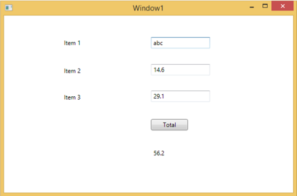
单击 Total 按钮后,您将看到程序在断点处停止
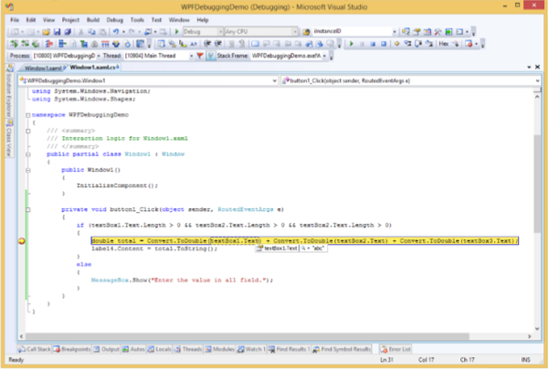
现在将光标移向 textbox1.Text,您将看到程序正在尝试将abc值与其他值相加,这就是程序崩溃的原因。
在 XAML 中调试
如果您期望在 XAML 中进行相同类型的调试,那么您会惊讶地发现,目前还不可能像调试任何其他过程语言代码那样调试 XAML 代码。当您在 XAML 代码中听到术语调试时,它意味着尝试并发现错误。
-
在数据绑定中,您的数据不会显示在屏幕上,您也不知道为什么
-
或者问题与复杂的布局有关。
-
或者对齐问题或边距颜色、覆盖等问题,使用一些广泛的模板,如列表框和组合框。
调试 XAML 程序通常是为了检查绑定是否有效;如果它不工作,然后检查什么是错的。不幸的是,除了 Silverlight 之外,无法在 XAML 绑定中设置断点,但我们可以使用“输出”窗口来检查数据绑定错误。让我们看一下下面的 XAML 代码,找出数据绑定中的错误。
<Window x:Class = "DataBindingOneWay.MainWindow"
   xmlns = "http://schemas.microsoft.com/winfx/2006/xaml/presentation"
   xmlns:x = "http://schemas.microsoft.com/winfx/2006/xaml"
   Title = "MainWindow" Height = "350" Width = "604">

   <Grid>
      <StackPanel Name = "Display">
         <StackPanel Orientation = "Horizontal" Margin = "50, 50, 0, 0">
            <TextBlock Text = "Name: " Margin = "10" Width = "100"/>
            <TextBlock Margin = "10" Width = "100" Text = "{Binding FirstName}"/>
         </StackPanel>

         <StackPanel Orientation = "Horizontal" Margin = "50,0,50,0">
            <TextBlock Text = "Title: " Margin = "10" Width = "100"/>
            <TextBlock Margin = "10" Width = "100" Text = "{Binding Title}" />
         </StackPanel>

      </StackPanel>
   </Grid>

</Window>
两个文本块的文本属性静态设置为“Name”和“Title”,而其他两个文本块文本属性绑定到“FirstName”和“Title”,但类变量是Employee类中的Name和Title,如下所示。
我们故意写了一个不正确的变量名,以便了解在未显示所需输出时我们可以在哪里找到这种类型的错误。
using System;
using System.Collections.Generic;
using System.Linq;
using System.Text;
using System.Threading.Tasks;

namespace DataBindingOneWay {

   public class Employee {
      public string Name { get; set; }
      public string Title { get; set; }

      public static Employee GetEmployee() {

         var emp = new Employee() {
            Name = "Ali Ahmed", Title = "Developer"
         };

         return emp;
      }
   }
}
下面是 C# 代码中 MainWindow 类的实现。
using System;
using System.Windows;
using System.Windows.Controls;

namespace DataBindingOneWay {
   /// <summary>
      /// Interaction logic for MainWindow.xaml
   /// </summary>

   public partial class MainWindow : Window {

      public MainWindow() {
         InitializeComponent();
         DataContext = Employee.GetEmployee();
      }
   }
}
让我们运行这个应用程序,您可以立即在我们的 MainWindow 中看到我们已成功绑定到该 Employee 对象的 Title 但名称未绑定。
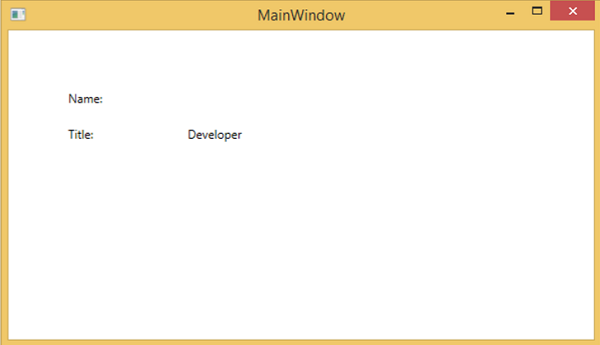
要检查名称发生了什么,让我们查看生成大量日志的输出窗口。
最容易发现的错误就是搜索错误,你会发现下面的错误,上面写着“BindingExpression path error: ‘FirstName’ property not found on ‘object”’Employe”
System.Windows.Data Error: 40 : BindingExpression path error: 'FirstName'
   property not found on 'object' ''Employee' (HashCode=11611730)'.
   BindingExpression:Path = FirstName; DataItem = 'Employee' (HashCode = 11611730);
   target element is 'TextBlock' (Name=''); target property is 'Text' (type 'String')
这清楚地表明 FirstName 不是 Employee 类的成员,因此它有助于解决应用程序中的此类问题。
当您再次将 FirstName 更改为 Name 时,您将看到所需的输出。
XAML 的 UI 调试工具
使用 Visual Studio 2015 为 XAML 引入了 UI 调试工具,以在运行时检查 XAML 代码。在这些工具的帮助下,XAML 代码以正在运行的 WPF 应用程序的可视化树以及树中不同 UI 元素属性的形式呈现。要启用这些工具,请按照以下步骤操作。
- 转到“工具”菜单,然后从“工具”菜单中选择“选项”。
- 它将打开以下对话框。
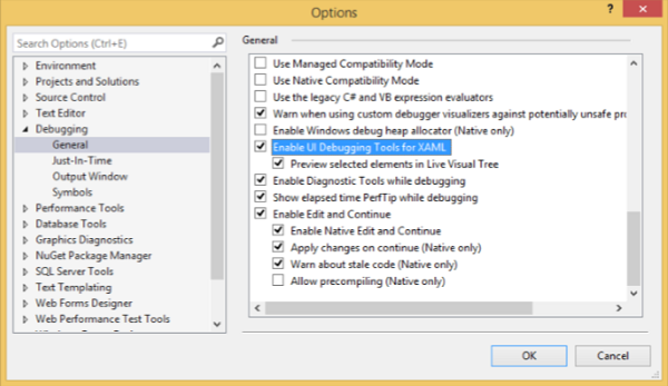
- 转到左侧调试项下的常规选项。
- 勾选突出显示的选项,即“启用 XAML 的 UI 调试工具”,然后单击“确定”按钮。
现在运行任何 XAML 应用程序或使用以下 XAML 代码。
<Window x:Class = "XAMLTestBinding.MainWindow"
   xmlns = "http://schemas.microsoft.com/winfx/2006/xaml/presentation"
   xmlns:x = "http://schemas.microsoft.com/winfx/2006/xaml"
   Title = "MainWindow" Height = "350" Width = "604">

   <StackPanel>
      <ComboBox Name = "comboBox"  Margin = "50" Width = "100">
         <ComboBoxItem Content = "Green" />
         <ComboBoxItem  Content = "Yellow" IsSelected = "True" />
         <ComboBoxItem Content = "Orange" />
      </ComboBox>

      <TextBox  Name = "textBox" Margin = "50" Width = "100" Height = "23"
         VerticalAlignment = "Top" Text  =
         "{Binding ElementName = comboBox, Path = SelectedItem.Content, Mode = TwoWay, UpdateSourceTrigger = PropertyChanged}"
         Background = "{Binding ElementName = comboBox, Path = SelectedItem.Content}">
      </TextBox>

   </StackPanel>

</Window>
当您执行应用程序时,它将显示实时可视树,其中所有元素都显示在树中。
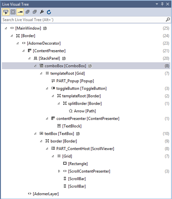
此实时可视化树显示了完整的布局结构,以了解 UI 元素所在的位置。但是此选项仅在 Visual Studio 2015 中可用。如果您使用的是 Visual Studio 的旧选项,则不能使用此工具,但是还有另一个工具可以与 Visual Studio 集成,例如 XAML Spy for Visual Studio . 你可以从xamlspy下载
WPF – 自定义控件
WPF 应用程序允许创建自定义控件,这使得创建功能丰富且可自定义的控件变得非常容易。当 Microsoft 提供的所有内置控件都不符合您的标准或您不想为第三方控件付费时,将使用自定义控件。
在本章中,您将学习如何创建自定义控件。在我们开始查看自定义控件之前,让我们先快速浏览一下用户控件。
用户控制
用户控件提供了一种方法来收集和组合不同的内置控件,并将它们打包成可重用的 XAML。用户控件用于以下场景 –
-
如果控件由现有控件组成,即您可以创建多个现有控件的单个控件。
-
如果控件不需要主题支持。用户控件不支持复杂的自定义、控件模板和难以设置的样式。
-
如果开发人员更喜欢使用代码隐藏模型编写控件,其中一个视图,然后是事件处理程序的直接代码。
-
您不会在应用程序之间共享您的控制权。
例子
让我们转到用户控件的示例并按照下面给出的步骤操作。
-
创建一个新的 WPF 项目,然后右键单击您的解决方案并选择添加 > 新建项目…
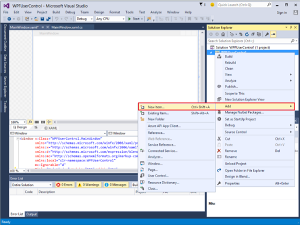
-
将打开以下窗口。现在选择用户控件 (WPF)并将其命名为 MyUserControl。
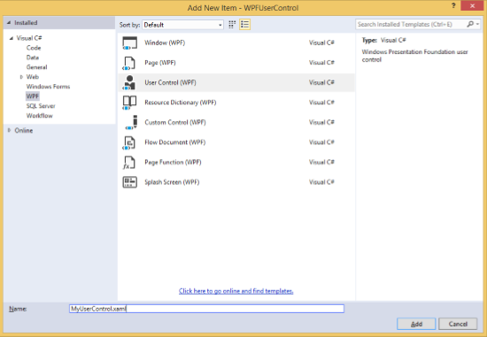
-
单击添加按钮,您将看到两个新文件(MyUserControl.xaml 和 MyUserControl.cs)将添加到您的解决方案中。
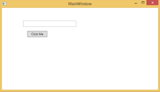
这是 XAML 代码,其中使用 MyUserControl.xaml 文件中的某些属性创建按钮和文本框。
<UserControl x:Class = "WPFUserControl.MyUserControl"
   xmlns = "http://schemas.microsoft.com/winfx/2006/xaml/presentation"
   xmlns:x = "http://schemas.microsoft.com/winfx/2006/xaml"
   xmlns:mc = "http://schemas.openxmlformats.org/markup-compatibility/2006"
   xmlns:d = "http://schemas.microsoft.com/expression/blend/2008"
   mc:Ignorable = "d" d:DesignHeight = "300" d:DesignWidth = "300">

   <Grid>
      <TextBox Height = "23"
         HorizontalAlignment = "Left"
         Margin = "80,49,0,0" Name = "txtBox"
         VerticalAlignment = "Top" Width = "200" />

      <Button Content = "Click Me"
         Height = "23" HorizontalAlignment = "Left"
         Margin = "96,88,0,0" Name = "button"
         VerticalAlignment = "Top" Click = "button_Click" />
   </Grid>

</UserControl>
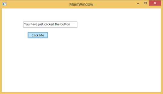
下面给出的是更新文本框的 MyUserControl.cs 文件中按钮单击事件的 C# 代码。
using System;
using System.Windows;
using System.Windows.Controls;

namespace WPFUserControl {
   /// <summary>
      /// Interaction logic for MyUserControl.xaml
   /// </summary>

   public partial class MyUserControl : UserControl {

      public MyUserControl() {
         InitializeComponent();
      }

      private void button_Click(object sender, RoutedEventArgs e) {
         txtBox.Text = "You have just clicked the button";
      }
   }
}
下面是在 MainWindow.xaml 中添加用户控件的实现。
<Window x:Class = "XAMLUserControl.MainWindow"
   xmlns = "http://schemas.microsoft.com/winfx/2006/xaml/presentation"
   xmlns:x = "http://schemas.microsoft.com/winfx/2006/xaml"
   xmlns:control = "clr-namespace:WPFUserControl"
   Title = "MainWindow" Height = "350" Width = "525">

   <Grid>
      <control:MyUserControl/>
   </Grid>

</Window>
当您编译并执行上述代码时,将产生以下窗口。
单击“单击我”按钮后,您会注意到文本框内的文本已更新。
自定义控件
自定义控件是一个类,它提供自己的样式和模板,通常在 generic.xaml 中定义。自定义控件用于以下场景 –
-
如果控件不存在并且您必须从头开始创建它。
-
如果您想通过添加额外的属性或额外的功能来扩展或添加功能到预先存在的控件以适合您的特定场景。
-
如果您的控件需要支持主题和样式。
-
如果您想跨应用程序共享您的控制。
例子
让我们举一个例子来了解自定义控件的工作原理。创建一个新的 WPF 项目,然后右键单击您的解决方案并选择添加 > 新建项目…
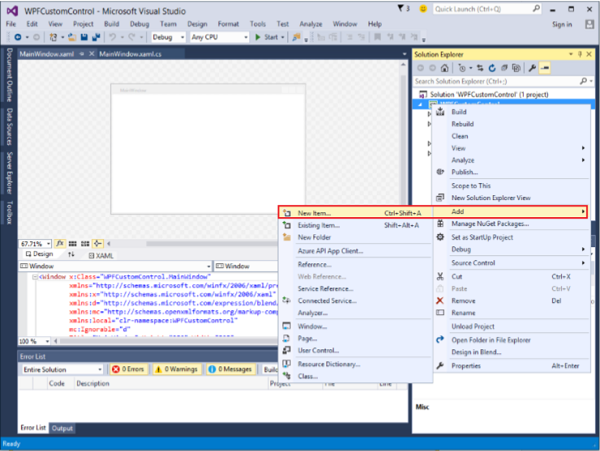
它将打开以下窗口。现在选择自定义控件 (WPF)并将其命名为MyCustomControl。
单击添加按钮,您将看到两个新文件(Themes/Generic.xaml 和 MyCustomControl.cs)将添加到您的解决方案中。
这是在 Generic.xaml 文件中为自定义控件设置样式的 XAML 代码。
<ResourceDictionary
   xmlns = "http://schemas.microsoft.com/winfx/2006/xaml/presentation"
   xmlns:x = "http://schemas.microsoft.com/winfx/2006/xaml"
   xmlns:local = "clr-namespace:WPFCustomControls">

   <Style TargetType = "{x:Type local:MyCustomControl}"
      BasedOn = "{StaticResource {x:Type Button}}">
      <Setter Property = "Background" Value = "LightSalmon" />
      <Setter Property = "Foreground" Value = "Blue"/>
   </Style>

</ResourceDictionary>
这是 MyCustomControl 类的 C# 代码,它是从按钮类继承的,并且在构造函数中它会覆盖元数据。
using System;
using System.Windows;
using System.Windows.Controls;

namespace WPFCustomControls {

   public class MyCustomControl : Button {

      static MyCustomControl() {
         DefaultStyleKeyProperty.OverrideMetadata(typeof(MyCustomControl), new
            FrameworkPropertyMetadata(typeof(MyCustomControl)));
      }

   }
}
这是 C# 中的自定义控件单击事件实现,它更新文本块的文本。
using System;
using System.Windows;
using System.Windows.Controls;

namespace WPFCustomControls {
   /// <summary>
      /// Interaction logic for MainWindow.xaml
   /// </summary>

   public partial class MainWindow : Window {

      public MainWindow() {
         InitializeComponent();
      }

      private void customControl_Click(object sender, RoutedEventArgs e) {
         txtBlock.Text = "You have just click your custom control";
      }

   }
}
这是在 MainWindow.xaml 中添加自定义控件和 TextBlock 的实现。
<Window x:Class = "WPFCustomControls.MainWindow"
   xmlns = "http://schemas.microsoft.com/winfx/2006/xaml/presentation"
   xmlns:x = "http://schemas.microsoft.com/winfx/2006/xaml"
   xmlns:control = "clr-namespace:WPFCustomControls"
   Title = "MainWindow" Height = "350" Width = "604">

   <StackPanel>
      <control:MyCustomControl x:Name = "customControl"
         Content = "Click Me" Width = "70"
         Margin = "10" Click = "customControl_Click"/>

      <TextBlock Name = "txtBlock"
         Width = "250" Height = "30"/>
   </StackPanel>

</Window>
当您编译并执行上面的代码时,它会生成以下带有自定义控件的窗口,该控件是一个自定义按钮。
单击自定义按钮后,您将看到文本块内的文本已更新。
WPF – 异常处理
异常是在程序执行期间遇到的任何错误条件或意外行为。由于多种原因可能会引发异常,其中一些如下 –
-
您的代码或您调用的代码中的错误(例如共享库),
-
不可用的操作系统资源,
-
公共语言运行时遇到的意外情况(例如无法验证的代码)
句法
异常具有将程序流从一个部分转移到另一个部分的能力。在 .NET 框架中,异常处理有以下四个关键字 –
-
try – 在此块中,程序识别出引发某些异常的特定条件。
-
catch – catch 关键字表示捕获异常。一个试块后跟一个或多个捕获块的地方在哪里,你要处理的问题的一个程序捕捉与异常处理异常。
-
finally – finally 块用于执行一组给定的语句,无论是否抛出异常。例如,如果您打开一个文件,无论是否引发异常,它都必须关闭。
-
throw – 当出现问题时程序抛出异常。这是使用 throw 关键字完成的。
使用这四个关键字的语法如下 –
try {
   ///This will still trigger the exception
}
catch (ExceptionClassName e) {
   // error handling code
}
catch (ExceptionClassName e) {
   // error handling code
}
catch (ExceptionClassName e) {
   // error handling code
}
finally {
   // statements to be executed
}
在 try 块可以根据程序流的情况引发多个异常的情况下,使用多个 catch 语句。
等级制度
.NET 框架中几乎所有的异常类都是直接或间接派生自 Exception 类。从 Exception 类派生的最重要的异常类是 –
-
ApplicationException 类– 它支持由程序生成的异常。当开发人员想要定义异常时,类应该从这个类派生出来。
-
SystemException 类– 它是所有预定义的运行时系统异常的基类。以下层次结构显示了运行时提供的标准异常。
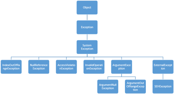
下表列出了运行时提供的标准异常以及创建派生类的条件。
| Exception type | 基础类型 | 描述 |
|---|---|---|
| Exception | 目的 | 所有异常的基类。 |
| SystemException | 例外 | 所有运行时生成的错误的基类。 |
| IndexOutOfRangeException | 系统异常 | 仅当数组索引不正确时由运行时抛出。 |
| NullReferenceException | 系统异常 | 仅在引用空对象时由运行时抛出。 |
| AccessViolationException | 系统异常 | 仅在访问无效内存时由运行时抛出。 |
| InvalidOperationException | 系统异常 | 处于无效状态时被方法抛出。 |
| ArgumentException | 系统异常 | 所有参数异常的基类。 |
| ArgumentNullException | 参数异常 | 由不允许参数为空的方法抛出。 |
| ArgumentOutOfRangeException | 参数异常 | 由验证参数在给定范围内的方法抛出。 |
| ExternalException | 系统异常 | 发生或针对运行时之外的环境的异常的基类。 |
| SEHException | 外部异常 | 异常封装 Win32 结构化异常处理信息。 |
例子
让我们举一个简单的例子来更好地理解这个概念。首先创建一个名为WPFExceptionHandling的新 WPF 项目。
将一个文本框从工具箱拖到设计窗口。以下 XAML 代码创建一个文本框并使用一些属性对其进行初始化。
<Window x:Class = "WPFExceptionHandling.MainWindow"
   xmlns = "http://schemas.microsoft.com/winfx/2006/xaml/presentation"
   xmlns:x = "http://schemas.microsoft.com/winfx/2006/xaml"
   xmlns:d = "http://schemas.microsoft.com/expression/blend/2008"
   xmlns:mc = "http://schemas.openxmlformats.org/markup-compatibility/2006"
   xmlns:local = "clr-namespace:WPFExceptionHandling"
   mc:Ignorable = "d"
   Title = "MainWindow" Height = "350" Width = "604">

   <Grid>
      <TextBox x:Name = "textBox" HorizontalAlignment = "Left"
         Height = "241" Margin = "70,39,0,0" TextWrapping = "Wrap"
         VerticalAlignment = "Top" Width = "453"/>
   </Grid>

</Window>
这是在 C# 中使用异常处理读取文件。
using System;
using System.IO;
using System.Windows;

namespace WPFExceptionHandling {

   public partial class MainWindow : Window {

      public MainWindow() {
         InitializeComponent();
         ReadFile(0);
      }

      void ReadFile(int index) {
         string path = @"D:\Test.txt";
         StreamReader file = new StreamReader(path);
         char[] buffer = new char[80];

         try {
            file.ReadBlock(buffer, index, buffer.Length);
            string str = new string(buffer);
            str.Trim();
            textBox.Text = str;
         }
         catch (Exception e) {
            MessageBox.Show("Error reading from "+ path + "\nMessage = "+ e.Message);
         }
         finally {
            if (file != null) {
               file.Close();
            }
         }
      }
   }
}
当您编译并执行上述代码时,它将产生以下窗口,其中文本框内显示文本。

当引发异常或您手动抛出异常时(如下面的代码所示),它将显示一个错误消息框。
using System;
using System.IO;
using System.Windows;

namespace WPFExceptionHandling {

   public partial class MainWindow : Window {

      public MainWindow() {
         InitializeComponent();
         ReadFile(0);
      }

      void ReadFile(int index) {
         string path = @"D:\Test.txt";
         StreamReader file = new StreamReader(path);
         char[] buffer = new char[80];

         try {
            file.ReadBlock(buffer, index, buffer.Length);
            string str = new string(buffer);
            throw new Exception();
            str.Trim();
            textBox.Text = str;
         }
         catch (Exception e) {
            MessageBox.Show("Error reading from "+ path + "\nMessage = "+ e.Message);
         }
         finally {
            if (file != null) {
               file.Close();
            }
         }
      }
   }
}
当执行上述代码时引发异常时,将显示以下消息。
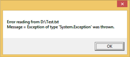
我们建议您执行上述代码并试验其功能。
WPF – 本地化
本地化是将应用程序资源翻译成应用程序支持的特定文化的本地化版本。
当您开发应用程序并且您的应用程序仅以一种语言提供时,您就限制了客户数量和业务规模。如果您想增加您的客户群,这也将增加您的业务,那么您的产品必须可供全球受众使用。经济高效的产品本地化是接触更多客户的最佳和最经济的方式之一。
在 WPF 中,使用resx文件非常容易创建可本地化的应用程序,这是最简单的本地化解决方案。让我们举一个简单的例子来了解它是如何工作的 –
-
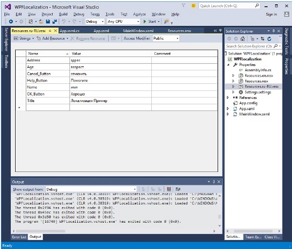
创建一个名为WPFLocalization的新 WPF 项目。
-
在您的解决方案资源管理器中,您将在 Properties 文件夹下看到 Resources.resx 文件。
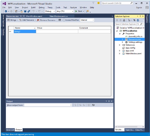
-
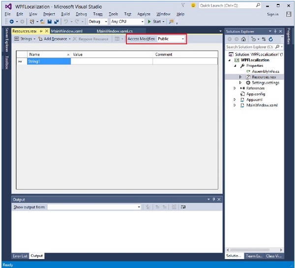
将访问修饰符从内部更改为公共,以便可以在 XAML 文件中访问它。
-
现在添加我们将在应用程序中使用的以下字符串的名称和值。
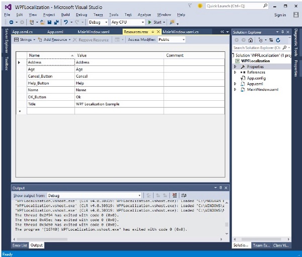
-
制作名为 Resources.en.resx 和 Resources.ru-RU.resx 的 Resources.resx 文件的两个副本。这些是特定于语言和国家/地区名称的命名约定,可以在国家语言支持 (NLS) API 参考 ( https://msdn.microsoft.com/en-us/goglobal/bb896001.aspx ) 页面上找到。
-
将 Resources.ru-RU.resx 中的值更改为俄语单词,如下所示。
-
让我们转到设计窗口并拖动三个文本框、三个标签和三个按钮。
-
在 XAML 文件中,首先添加命名空间声明以使用本地化资源xmlns:p = “clr-namespace:WPFLocalization.Properties”
-
设置所有控件的属性,如下所示。在此示例中,我们不会将硬编码字符串用于 XAML 文件中窗口的标签、按钮和标题的内容。我们将使用在 *.resx 文件中定义的字符串。例如,对于窗口的标题,我们使用在 *.resx 文件中定义的标题字符串,如“Title = “{x:Static p:Resources.Title}””
-
这是 XAML 文件,其中使用不同的属性创建和初始化控件。
<Window x:Class = "WPFLocalization.MainWindow"
xmlns = "http://schemas.microsoft.com/winfx/2006/xaml/presentation"
xmlns:x = "http://schemas.microsoft.com/winfx/2006/xaml"
xmlns:local = "clr-namespace:WPFLocalization"
xmlns:p = "clr-namespace:WPFLocalization.Properties"
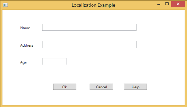
Title = "{x:Static p:Resources.Title}" Height = "350" Width = "604">
<Grid>
<TextBox x:Name = "textBox" HorizontalAlignment = "Left" Height = "23"
Margin = "128,45,0,0" TextWrapping = "Wrap" VerticalAlignment = "Top" Width = "304"/>
<Label x:Name = "label" Content = "{x:Static p:Resources.Name}"
HorizontalAlignment = "Left" Margin = "52,45,0,0" VerticalAlignment = "Top" Width = "86"/>
<TextBox x:Name = "textBox1" HorizontalAlignment = "Left" Height = "23"
Margin = "128,102,0,0" TextWrapping = "Wrap" VerticalAlignment = "Top" Width = "304"/>
<Label x:Name = "label1" Content = "{x:Static p:Resources.Address}"
HorizontalAlignment = "Left" Margin = "52,102,0,0" VerticalAlignment = "Top" Width = "86"/>
<TextBox x:Name = "textBox2" HorizontalAlignment = "Left" Height = "23"
Margin = "128,157,0,0" TextWrapping = "Wrap" VerticalAlignment = "Top" Width = "80"/>
<Label x:Name = "label2" Content = "{x:Static p:Resources.Age}"
HorizontalAlignment = "Left" Margin = "52,157,0,0" VerticalAlignment = "Top" Width = "86"/>
<Button x:Name = "button" Content = "{x:Static p:Resources.OK_Button}"
HorizontalAlignment = "Left" Margin = "163,241,0,0" VerticalAlignment = "Top" Width = "75"/>
<Button x:Name = "button1" Content = "{x:Static p:Resources.Cancel_Button}"
HorizontalAlignment = "Left" Margin = "282,241,0,0" VerticalAlignment = "Top" Width = "75"/>
<Button x:Name = "button2" Content = "{x:Static p:Resources.Help_Button}"
HorizontalAlignment = "Left" Margin = "392,241,0,0" VerticalAlignment = "Top" Width = "75"/>
</Grid>
</Window>
-
编译并执行上述代码后,您将看到以下窗口,其中包含不同的控件。
-
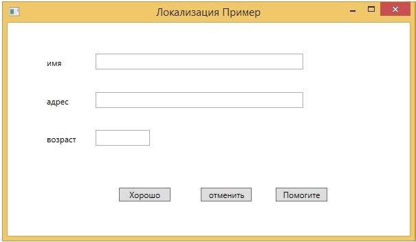
默认情况下,程序使用默认的 Resources.resx。如果要显示 Resources.ru-RU.resx 文件中定义的俄语文本,则需要在 App.xaml 文件中启动程序时显式设置区域性,如下所示。
using System.Windows;

namespace WPFLocalization {
   /// <summary>
      /// Interaction logic for App.xaml
   /// </summary>

   public partial class App : Application {

      App() {
         System.Threading.Thread.CurrentThread.CurrentUICulture = new System.Globalization.CultureInfo("ru-RU");
         //System.Threading.Thread.CurrentThread.CurrentUICulture = new System.Globalization.CultureInfo("en");
      }
   }
}
当您运行您的应用程序时,您将看到所有俄语文本。
我们建议您执行上述代码并为其他文化创建 resx 文件。
WPF – 交互
在 WPF 中,交互显示了视图如何与位于该视图中的控件进行交互。最常见的交互有两种类型 –
- 行为
- 拖放
行为
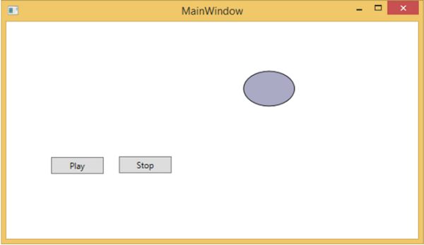
Expression Blend 3 引入了行为,它可以将一些功能封装到一个可重用的组件中。要添加其他行为,您可以将这些组件附加到控件。行为为轻松设计复杂的用户交互提供了更大的灵活性。
让我们看一个简单的示例,其中 ControlStoryBoardAction 行为附加到控件。
-
创建一个名为 WPFBehavior 的新 WPF 项目。
-
以下 XAML 代码创建一个椭圆和两个按钮来控制椭圆的移动。
<Window
   xmlns = "http://schemas.microsoft.com/winfx/2006/xaml/presentation"
   xmlns:x = "http://schemas.microsoft.com/winfx/2006/xaml"
   xmlns:d = "http://schemas.microsoft.com/expression/blend/2008"
   xmlns:mc = "http://schemas.openxmlformats.org/markup-compatibility/2006"
   xmlns:local = "clr-namespace:WPFBehaviors"
   xmlns:i = "http://schemas.microsoft.com/expression/2010/interactivity"
   xmlns:ei = "http://schemas.microsoft.com/expression/2010/interactions"
   x:Class = "WPFBehaviors.MainWindow"
   mc:Ignorable = "d" Title = "MainWindow" Height = "350" Width = "604">

   <Window.Resources>
      <Storyboard x:Key = "Storyboard1" RepeatBehavior = "Forever" AutoReverse = "True">

         <DoubleAnimationUsingKeyFrames Storyboard.TargetProperty =
            "(UIElement.RenderTransform).(TransformGroup.Children )[3].(TranslateTransform.X)"
            Storyboard.TargetName = "ellipse">
            <EasingDoubleKeyFrame KeyTime = "0:0:1" Value = "301.524"/>
            <EasingDoubleKeyFrame KeyTime = "0:0:2" Value = "2.909"/>
         </DoubleAnimationUsingKeyFrames>

         <DoubleAnimationUsingKeyFrames Storyboard.TargetProperty =
            "(UIElement.RenderTransform).(TransformGroup.Children )[3].(TranslateTransform.Y)"
            Storyboard.TargetName = "ellipse">
            <EasingDoubleKeyFrame KeyTime = "0:0:1" Value = "-0.485"/>
            <EasingDoubleKeyFrame KeyTime = "0:0:2" Value = "0"/>
         </DoubleAnimationUsingKeyFrames>

         <ObjectAnimationUsingKeyFrames Storyboard.TargetProperty = "(ContentControl.Content)"
            Storyboard.TargetName = "button">
            <DiscreteObjectKeyFrame KeyTime = "0" Value = "Play"/>
         </ObjectAnimationUsingKeyFrames>

         <ObjectAnimationUsingKeyFrames Storyboard.TargetProperty = "(ContentControl.Content)"
            Storyboard.TargetName = "button1">
            <DiscreteObjectKeyFrame KeyTime = "0" Value = "Stop"/>
            <DiscreteObjectKeyFrame KeyTime = "0:0:2" Value = "Stop"/>
         </ObjectAnimationUsingKeyFrames>
      </Storyboard>
   </Window.Resources>

   <Window.Triggers>
      <EventTrigger RoutedEvent = "FrameworkElement.Loaded">
         <BeginStoryboard Storyboard = "{StaticResource Storyboard1}"/>
      </EventTrigger>
   </Window.Triggers>

   <Grid>
      <Ellipse x:Name = "ellipse" Fill = "#FFAAAAC5" HorizontalAlignment = "Left"
         Height = "50.901" Margin = "49.324,70.922,0,0" Stroke = "Black"
         VerticalAlignment = "Top" Width = "73.684" RenderTransformOrigin = "0.5,0.5">
         <Ellipse.RenderTransform>
            <TransformGroup>
               <ScaleTransform/>
               <SkewTransform/>
               <RotateTransform/>
               <TranslateTransform/>
            </TransformGroup>
         </Ellipse.RenderTransform>
      </Ellipse>

      <Button x:Name = "button" Content = "Play" HorizontalAlignment = "Left" Height = "24.238"
         Margin = "63.867,0,0,92.953" VerticalAlignment = "Bottom" Width = "74.654">
         <i:Interaction.Triggers>
            <i:EventTrigger EventName = "Click">
               <ei:ControlStoryboardAction Storyboard = "{StaticResource Storyboard1}"/>
            </i:EventTrigger>
         </i:Interaction.Triggers>
      </Button>

      <Button x:Name = "button1" Content = "Stop" HorizontalAlignment = "Left" Height = "24.239"
         Margin = "160.82,0,0,93.922" VerticalAlignment = "Bottom" Width = "75.138">
         <i:Interaction.Triggers>
            <i:EventTrigger EventName = "Click">
               <ei:ControlStoryboardAction ControlStoryboardOption = "Stop"
                  Storyboard = "{StaticResource Storyboard1}"/>
            </i:EventTrigger>
         </i:Interaction.Triggers>
      </Button>

   </Grid>
</Window>
当您编译并执行上述代码时,它将产生以下窗口,其中包含一个椭圆和两个按钮。
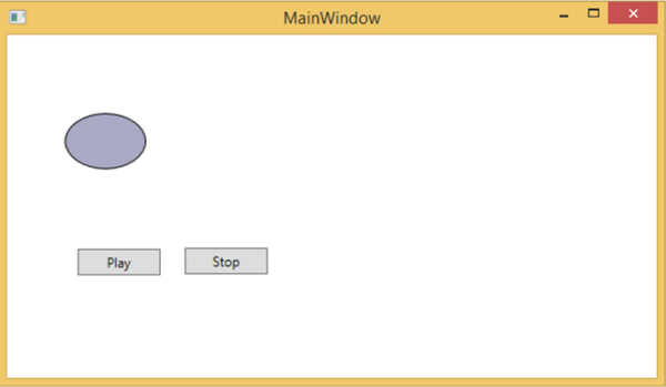
当您按下播放按钮时,它将开始从左向右移动,然后返回到其原始位置。停止按钮将停止椭圆的运动。
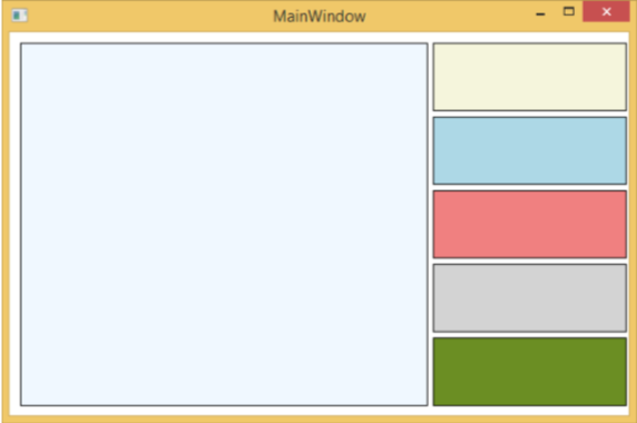
拖放
在用户界面上拖放可以显着提高应用程序的效率和生产力。使用拖放功能的应用程序很少,因为人们认为它很难实现。在某种程度上,处理拖放功能很困难,但在 WPF 中,您可以轻松处理它。
让我们举一个简单的例子来理解它是如何工作的。我们将创建一个应用程序,您可以在其中将颜色从一个矩形拖放到另一个矩形。
-
创建一个名为 WPFDragAndDrop 的新 WPF 项目。
-
将五个矩形拖到设计窗口并设置属性,如以下 XAML 文件中所示。
<Window x:Class = "WPFDragAndDrop.MainWindow"
   xmlns = "http://schemas.microsoft.com/winfx/2006/xaml/presentation"
   xmlns:x = "http://schemas.microsoft.com/winfx/2006/xaml"
   xmlns:d = "http://schemas.microsoft.com/expression/blend/2008"
   xmlns:mc = "http://schemas.openxmlformats.org/markup-compatibility/2006"
   xmlns:local = "clr-namespace:WPFDragAndDrop"
   mc:Ignorable = "d" Title = "MainWindow" Height = "402.551" Width = "604">

   <Grid>
      <Rectangle Name = "Target" Fill = "AliceBlue" HorizontalAlignment = "Left"
         Height = "345" Margin = "10,10,0,0" Stroke = "Black"
         VerticalAlignment = "Top" Width = "387" AllowDrop = "True" Drop = "Target_Drop"/>

      <Rectangle Fill = "Beige" HorizontalAlignment = "Left" Height = "65"
         Margin = "402,10,0,0" Stroke = "Black" VerticalAlignment = "Top"
         Width = "184" MouseLeftButtonDown = "Rect_MLButtonDown"/>

      <Rectangle Fill = "LightBlue" HorizontalAlignment = "Left" Height = "65"
         Margin = "402,80,0,0" Stroke = "Black" VerticalAlignment = "Top"
         Width = "184" MouseLeftButtonDown = "Rect_MLButtonDown"/>

      <Rectangle Fill = "LightCoral" HorizontalAlignment = "Left" Height = "65"
         Margin = "402,150,0,0" Stroke = "Black" VerticalAlignment = "Top"
         Width = "184" MouseLeftButtonDown = "Rect_MLButtonDown"/>

      <Rectangle Fill = "LightGray" HorizontalAlignment = "Left" Height = "65"
         Margin = "402,220,0,0" Stroke = "Black" VerticalAlignment = "Top"
         Width = "184" MouseLeftButtonDown = "Rect_MLButtonDown"/>

      <Rectangle Fill = "OliveDrab" HorizontalAlignment = "Left" Height = "65"
         Margin = "402,290,0,-7" Stroke = "Black" VerticalAlignment = "Top"
         Width = "184" MouseLeftButtonDown = "Rect_MLButtonDown"/>
   </Grid>

</Window>
-
第一个矩形是目标矩形,因此用户可以将颜色从另一个矩形拖动到目标矩形。
-
下面给出了 C# 中用于拖放的事件实现。
using System.Windows;
using System.Windows.Input;
using System.Windows.Media;
using System.Windows.Shapes;

namespace WPFDragAndDrop {
   /// <summary>
      /// Interaction logic for MainWindow.xaml
   /// </summary>

   public partial class MainWindow : Window {

      public MainWindow() {
         InitializeComponent();
      }

      private void Rect_MLButtonDown(object sender, MouseButtonEventArgs e) {
         Rectangle rc = sender as Rectangle;
         DataObject data = new DataObject(rc.Fill);
         DragDrop.DoDragDrop(rc, data,DragDropEffects.Move);
      }

      private void Target_Drop(object sender, DragEventArgs e) {
         SolidColorBrush scb = (SolidColorBrush)e.Data.GetData(typeof(SolidColorBrush));
         Target.Fill = scb;
      }
   }
}
当您运行您的应用程序时,它将产生以下窗口。
如果您从右侧的矩形中拖动一种颜色并将其放在左侧的大矩形上,您将立即看到其效果。
让我们拖动 4th 一个从右侧。
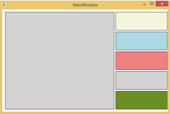
可以看到目标矩形的颜色发生了变化。我们建议您执行上述代码并试验其功能。
WPF – 2D 图形
WPF 提供了广泛的 2D 图形,可以根据您的应用程序要求对其进行增强。WPF 支持用于绘制图形内容的 Drawing 和 Shape 对象。
形状和绘图
-
Shape 类派生自 FrameworkElement 类,Shape 对象可用于面板和大多数控件中。
-
WPF 提供了一些从 Shape 类派生的基本形状对象,例如 Ellipse、Line、Path、Polygon、Polyline 和 Rectangle。
-
另一方面,绘图对象不是从 FrameworkElement 类派生的,而是提供更轻量级的实现。
-
与形状对象相比,绘图对象更简单。它们也具有更好的性能特征。
例子
让我们通过一个简单的例子来理解如何使用不同的形状对象。
-
创建一个名为WPF2DGraphics的新 WPF 项目。
-
以下代码创建不同类型的形状。
<Window x:Class = "WPF2DGraphics.MainWindow"
   xmlns = "http://schemas.microsoft.com/winfx/2006/xaml/presentation"
   xmlns:x = "http://schemas.microsoft.com/winfx/2006/xaml"
   xmlns:d = "http://schemas.microsoft.com/expression/blend/2008"
   xmlns:mc = "http://schemas.openxmlformats.org/markup-compatibility/2006"
   xmlns:local = "clr-namespace:WPF2DGraphics"
   xmlns:PresentationOptions = "http://schemas.microsoft.com/winfx/2006/xaml/present ation/options"
   mc:Ignorable = "PresentationOptions" Title = "MainWindow" Height = "400" Width = "604">

   <StackPanel>
      <Ellipse Width = "100" Height = "60" Name = "sample" Margin = "10">
         <Ellipse.Fill>
            <RadialGradientBrush>
               <GradientStop Offset = "0" Color = "AliceBlue"/>
               <GradientStop Offset = "1" Color = "Gray"/>
               <GradientStop Offset = "2" Color = "Red"/>
            </RadialGradientBrush>
         </Ellipse.Fill>
      </Ellipse>

      <Path Stroke = "Red" StrokeThickness = "5" Data = "M 10,70 L 200,70"
         Height = "42.085" Stretch = "Fill" Margin = "140.598,0,146.581,0" />
      <Path Stroke = "BlueViolet" StrokeThickness = "5" Data = "M 20,100 A 100,56 42 1 0 200,10"
         Height = "81.316" Stretch = "Fill" Margin = "236.325,0,211.396,0" />

      <Path Fill = "LightCoral" Margin = "201.424,0,236.325,0"
         Stretch = "Fill" Height = "124.929">
         <Path.Data>
            <PathGeometry>
               <PathFigure StartPoint = "50,0" IsClosed = "True">
                  <LineSegment Point = "100,50"/>
                  <LineSegment Point = "50,100"/>
                  <LineSegment Point = "0,50"/>
               </PathFigure>
            </PathGeometry>
         </Path.Data>
      </Path>

   </StackPanel>

</Window>
当你编译并执行上面的代码时,它会产生一个椭圆、一条直线、一个圆弧和一个多边形。
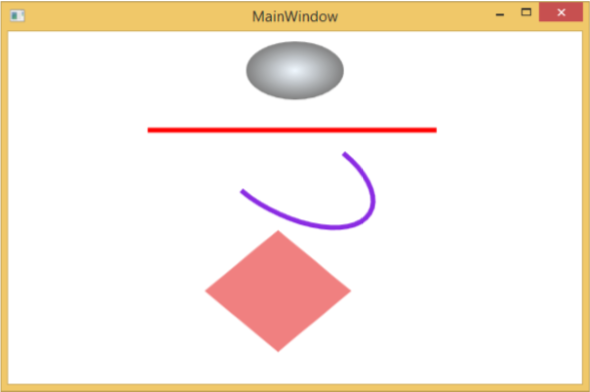
例子
让我们看一下另一个示例,该示例展示了如何使用绘图绘制区域。
-
创建一个名为WPF2DGraphics1的新 WPF 项目。
-
以下 XAML 代码显示了如何使用图像绘制进行不同的绘制。
<Window x:Class = "WPF2DGraphics1.MainWindow"
   xmlns = "http://schemas.microsoft.com/winfx/2006/xaml/presentation"
   xmlns:x = "http://schemas.microsoft.com/winfx/2006/xaml"
   xmlns:d = "http://schemas.microsoft.com/expression/blend/2008"
   xmlns:PresentationOptions = "http://schemas.microsoft.com/winfx/2006/xaml/present ation/options"
   xmlns:mc = "http://schemas.openxmlformats.org/markup-compatibility/2006"
   mc:Ignorable = "PresentationOptions"
   xmlns:local = "clr-namespace:WPF2DGraphics1" Title = "MainWindow" Height = "350" Width = "604">

   <Grid>
      <Border BorderBrush = "Gray" BorderThickness = "1"
         HorizontalAlignment = "Left" VerticalAlignment = "Top"
         Margin = "20">

         <Image Stretch = "None">
            <Image.Source>
               <DrawingImage PresentationOptions:Freeze = "True">

                  <DrawingImage.Drawing>
                     <DrawingGroup>
                        <ImageDrawing Rect = "300,100,300,180" ImageSource = "Images\DSC_0104.JPG"/>
                        <ImageDrawing Rect = "0,100,250,100" ImageSource = "Images\DSC_0104.JPG"/>
                        <ImageDrawing Rect = "150,0,25,25" ImageSource = "Images\DSC_0104.JPG"/>
                        <ImageDrawing Rect = "0,0,75,75" ImageSource = "Images\DSC_0104.JPG"/>
                     </DrawingGroup>
                  </DrawingImage.Drawing>

               </DrawingImage>
            </Image.Source>
         </Image>

      </Border>
   </Grid>

</Window>
当您运行应用程序时,它将产生以下输出 –
我们建议您执行上述代码并尝试更多的 2D 形状和绘图。
WPF – 3D 图形
Windows Presentation Foundation (WPF) 提供了根据您的应用程序要求绘制、转换和动画 3D 图形的功能。它不支持完整的 3D 游戏开发,但在某种程度上,您可以创建 3D 图形。
通过结合 2D 和 3D 图形,您还可以创建丰富的控件、提供复杂的数据插图或增强应用程序界面的用户体验。Viewport3D 元素将 3D 模型托管到我们的 WPF 应用程序中。
例子
让我们通过一个简单的例子来了解如何使用 3D 图形。
-
创建一个名为WPF3DGraphics的新 WPF 项目。
-
以下 XAML 代码显示了如何使用 3D 几何体创建 2D 对象。
<Window x:Class = "WPF3DGraphics.MainWindow"
   xmlns = "http://schemas.microsoft.com/winfx/2006/xaml/presentation"
   xmlns:x = "http://schemas.microsoft.com/winfx/2006/xaml"
   xmlns:mc = "http://schemas.openxmlformats.org/markup-compatibility/2006"
   xmlns:local = "clr-namespace:WPF3DGraphics"
   mc:Ignorable = "d" Title = "MainWindow" Height = "500" Width = "604">

   <Grid>
      <Viewport3D>

         <Viewport3D.Camera>
            <PerspectiveCamera Position = "2,0,10" LookDirection = "0.2,0.4,-1"
               FieldOfView = "65" UpDirection = "0,1,0" />
         </Viewport3D.Camera>

         <ModelVisual3D>
            <ModelVisual3D.Content>
               <Model3DGroup>
                  <AmbientLight Color = "Bisque" />

                  <GeometryModel3D>
                     <GeometryModel3D.Geometry>
                        <MeshGeometry3D Positions = "0,0,0 0,8,0 10,0,0 8,8,0"
                           Normals = "0,0,1 0,0,1 0,0,1 0,0,1" TriangleIndices = "0,2,1 1,2,3"/>
                     </GeometryModel3D.Geometry>

                     <GeometryModel3D.Material>
                        <DiffuseMaterial Brush = "Bisque" />
                     </GeometryModel3D.Material>
                  </GeometryModel3D>

               </Model3DGroup>
            </ModelVisual3D.Content>
         </ModelVisual3D>

      </Viewport3D>
   </Grid>

</Window>
当你编译并执行上面的代码时,它会产生一个 3D 的 2D 对象。
例子
让我们看另一个显示 3D 对象的示例。
-
创建一个名为WPF3DGraphics1的新 WPF 项目
-
以下 XAML 代码创建一个 3D 对象和一个滑块。在滑块的帮助下,您可以旋转这个 3D 对象。
<Window x:Class = "WPF3DGraphics1.MainWindow"
   xmlns = "http://schemas.microsoft.com/winfx/2006/xaml/presentation"
   xmlns:x = "http://schemas.microsoft.com/winfx/2006/xaml"
   xmlns:d = "http://schemas.microsoft.com/expression/blend/2008"
   xmlns:mc = "http://schemas.openxmlformats.org/markup-compatibility/2006"
   xmlns:local = "clr-namespace:WPF3DGraphics1"
   mc:Ignorable = "d" Title = "MainWindow" Height = "350" Width = "525">

   <Grid>
      <Viewport3D Name="viewport3D1">

         <Viewport3D.Camera>
            <PerspectiveCamera x:Name = "camMain" Position = "6 5 4" LookDirection = "-6 -5 -4">
            </PerspectiveCamera>
         </Viewport3D.Camera>

         <ModelVisual3D>
            <ModelVisual3D.Content>
               <DirectionalLight x:Name = "dirLightMain" Direction = "-1,-1,-1">
               </DirectionalLight>
            </ModelVisual3D.Content>
         </ModelVisual3D>

         <ModelVisual3D x:Name = "MyModel">
            <ModelVisual3D.Content>
               <GeometryModel3D>

                  <GeometryModel3D.Geometry>
                     <MeshGeometry3D x:Name = "meshMain"
                        Positions = "0 0 0  1 0 0  0 1 0  1 1 0  0 0 1  1 0 1  0 1 1  0 1 1"
                        TriangleIndices = "2 3 1  3 1 0  7 1 3  7 5 1  6 5 7  6 4 5  6 2 0
                        2 0 4  2 7 3  2 6 7  0 1 5  0 5 4">
                     </MeshGeometry3D>
                  </GeometryModel3D.Geometry>

                  <GeometryModel3D.Material>
                     <DiffuseMaterial x:Name = "matDiffuseMain">
                        <DiffuseMaterial.Brush>
                           <SolidColorBrush Color = "Bisque"/>
                        </DiffuseMaterial.Brush>
                     </DiffuseMaterial>
                  </GeometryModel3D.Material>

               </GeometryModel3D>
            </ModelVisual3D.Content>

            <ModelVisual3D.Transform>
               <RotateTransform3D>
                  <RotateTransform3D.Rotation>
                     <AxisAngleRotation3D x:Name = "rotate" Axis = "1 2 1"/>
                  </RotateTransform3D.Rotation>
               </RotateTransform3D>
            </ModelVisual3D.Transform>

         </ModelVisual3D>
      </Viewport3D>

      <Slider Height = "23" HorizontalAlignment = "Left"
         Margin = "145,271,0,0" Name = "slider1"
         VerticalAlignment = "Top" Width = "269"
         Maximum = "360"
         Value = "{Binding ElementName = rotate, Path=Angle}" />

   </Grid>

</Window>
当您运行您的应用程序时,它将在您的窗口上生成一个 3D 对象和一个滑块。
当您滑动滑块时,窗口上的对象也会旋转。
我们建议您执行上述代码并尝试更多 3D 几何体。
WPF – 多媒体
WPF 应用程序使用MediaElement支持视频和音频。它允许您将音频和视频集成到应用程序中。MediaElement 类的工作方式与 Image 类类似。你只需将它指向媒体,它就会呈现它。主要区别在于它将是一个移动图像,但是如果您将其指向仅包含音频而没有视频的文件(例如 MP3),它将播放该文件而不在屏幕上显示任何内容。
WPF 支持所有类型的视频/音频格式,具体取决于机器配置。如果媒体文件播放媒体播放器,它也将在同一台机器上的 WPF 中工作。
例子
让我们举一个例子来了解如何在您的应用程序中集成多媒体。
-
创建一个名为WPFMultimedia的新 WPF 项目。
-
以下 XAML 代码创建一个媒体元素和三个按钮,并使用一些属性对其进行初始化。
<Window x:Class = "WPFMultimedia.MainWindow"
   xmlns = "http://schemas.microsoft.com/winfx/2006/xaml/presentation"
   xmlns:x = "http://schemas.microsoft.com/winfx/2006/xaml"
   xmlns:d = "http://schemas.microsoft.com/expression/blend/2008"
   xmlns:mc = "http://schemas.openxmlformats.org/markup-compatibility/2006"
   xmlns:local = "clr-namespace:WPFMultimedia"
   mc:Ignorable = "d" Title = "MainWindow" Height = "350" Width = "604">

   <Grid>
      <StackPanel HorizontalAlignment = "Center" VerticalAlignment = "Center">
         <MediaElement Name = "myMedia" Source = "D:\MicrosoftMVA.mp4"
            LoadedBehavior = "Manual" Width = "591" Height = "274" />
         <StackPanel Orientation = "Horizontal" Margin = "0,10,0,0">
            <Button Content = "Play" Margin = "0,0,10,0" Padding = "5" Click = "mediaPlay" />
            <Button Content = "Pause" Margin = "0,0,10,0" Padding = "5" Click = "mediaPause" />
            <Button x:Name = "muteButt" Content = "Mute" Padding = "5" Click = "mediaMute" />
         </StackPanel>
      </StackPanel>
   </Grid>

</Window>
这是 C# 中不同按钮的 Click 事件实现。
using System;
using System.Windows;

namespace WPFMultimedia {

   public partial class MainWindow : Window {

      public MainWindow() {
         InitializeComponent();
         myMedia.Volume = 100;
         myMedia.Play();
      }

      void mediaPlay(Object sender, EventArgs e) {
         myMedia.Play();
      }

      void mediaPause(Object sender, EventArgs e) {
         myMedia.Pause();
      }

      void mediaMute(Object sender, EventArgs e) {

         if (myMedia.Volume == 100) {
            myMedia.Volume = 0;
            muteButt.Content = "Listen";
         }
         else {
            myMedia.Volume = 100;
            muteButt.Content = "Mute";
         }
      }
   }
}
当您编译并执行上述代码时,将产生以下窗口。您可以使用三个按钮播放视频并控制其播放。
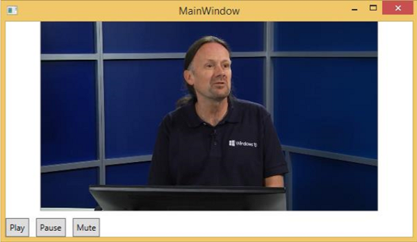
通过按钮,您可以暂停、静音和播放视频。
语音合成器
WPF 具有将文本转换为语音的功能。此 API 包含在 System.Speech 命名空间中。SpeechSynthesizer类将文本转换为口语。
例子
让我们看一个简单的例子。
-
创建一个名为WPFTextToSpeech的新 WPF 项目。
-
我们需要将 System.Speech 程序集添加为SpeechSynthesizer类的参考才能工作。
-
右键单击引用并选择添加引用。
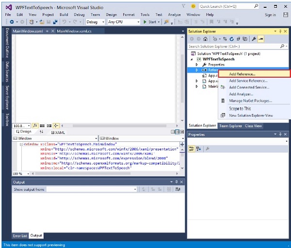
-
将打开参考管理器对话框。现在选中 System.Speech 复选框
-
单击确定按钮。您可以在参考文献中看到 System.Speech 程序集。
-
现在将一个按钮和一个文本框从工具箱拖到设计窗口中。
-
以下 XAML 代码创建一个按钮和一个文本框,并使用一些属性对其进行初始化。
<Window x:Class = "WPFTextToSpeech.MainWindow"
   xmlns = "http://schemas.microsoft.com/winfx/2006/xaml/presentation"
   xmlns:x = "http://schemas.microsoft.com/winfx/2006/xaml"
   xmlns:d = "http://schemas.microsoft.com/expression/blend/2008"
   xmlns:mc = "http://schemas.openxmlformats.org/markup-compatibility/2006"
   xmlns:local = "clr-namespace:WPFTextToSpeech"
   mc:Ignorable = "d" Title = "MainWindow" Height = "350" Width = "604">

   <Grid>
      <Button x:Name = "button" Content = "Speak"
         HorizontalAlignment = "Left" Margin = "218,176,0,0"
         VerticalAlignment = "Top" Width = "75"/>

      <TextBox x:Name = "textBox" HorizontalAlignment = "Left"
         Height = "23" Margin = "60,104,0,0" TextWrapping = "Wrap"
         VerticalAlignment = "Top" Width = "418"/>
   </Grid>

</Window>
-
这是 C# 中的简单实现,它将文本框中的文本转换为口语。
using System.Speech.Synthesis;
using System.Windows;

namespace WPFTextToSpeech {
   /// <summary>
      /// Interaction logic for MainWindow.xaml
   /// </summary>

   public partial class MainWindow : Window {

      public MainWindow() {
         InitializeComponent();
      }

      private void button_Click(object sender, RoutedEventArgs e) {

         if (textBox.Text != "") {
            SpeechSynthesizer speechSynthesizer = new SpeechSynthesizer();
            speechSynthesizer.Speak(textBox.Text);
         }
         else {
            MessageBox.Show("Write some thing in the textbox!");
         }
      }
   }
}
当您编译并执行上述代码时,将产生以下窗口。现在,在文本框中键入 Hello World 并单击 Speak 按钮。
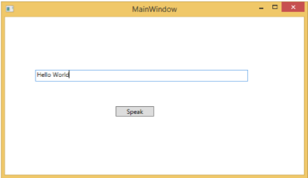
它将产生声音“Hello World”。如果您没有在文本框中输入任何内容,那么它将闪烁以下消息。
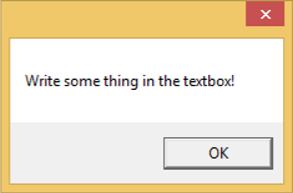
我们建议您执行上述示例。
